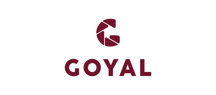
GOYAL

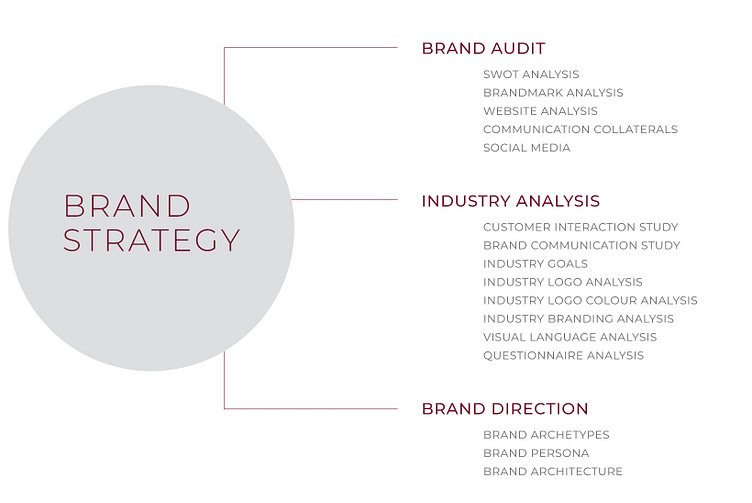
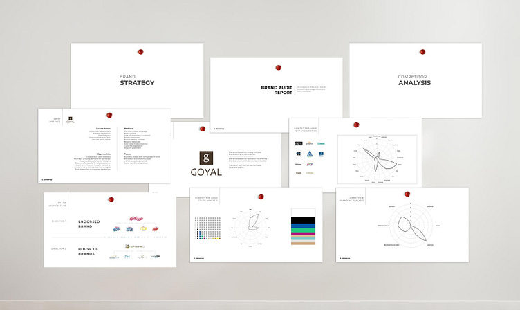
The decision to rebrand is a realisation that time has accumulated in your brand. This time accounts for growth, learnings and expansion that needs to be re-visualised. Such a revisualisation requires strategic analysis of the gaps between the brand current and aspired persona. Then reconsolidating that with new vision and positioning.
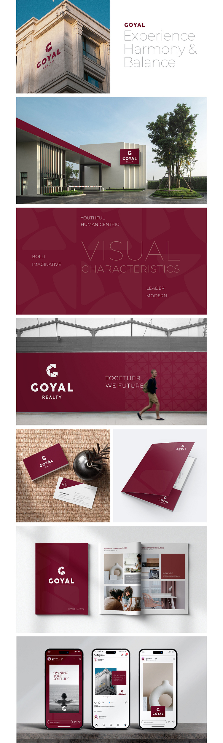
The branding strategy for Goyal Group was aligned with industry goals by studying competition and pursuing the need to be innovative, design-centric and humanistic. The branding persona and philosophy borrowed majorly from the brand's legacy and imbued strong features like confidence, charisma and interaction. The team at Goyal Group requested that this revisualisation be emphasised for their Realty business vertical.
The realty industry is agog with identities that focus on geometry and structure for easy recall. It is less focused on the brand's humanistic values and usually echoes its outcome. The preliminary meeting routines with key stakeholders at Goyal led to a notion that the identity needs to be redirected with a focus on value for customers and the commitment and quality that is delivered. A value-based story was born and so was the need to imply industry experience and leadership.
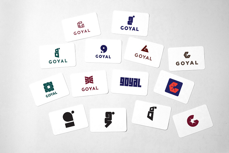
Here are some Logo Explorations
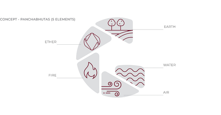
The essence of the new logo is universal in its rendition and resonates a synergistic relationship between construction and community through its repetition up and outwards.
The radiance of natural order is captured in the variable visual forms that can be dynamically animated. The new identity was rooted in the need to communicate a holistic offering as against a very utilitarian logomark. A traditional business that has sustained its qualitative focus, wanted the rebranding to incorporate its roots and vision in a more organic narrative. With a people come first approach, which is not only progressive but also the need of any business nowadays.
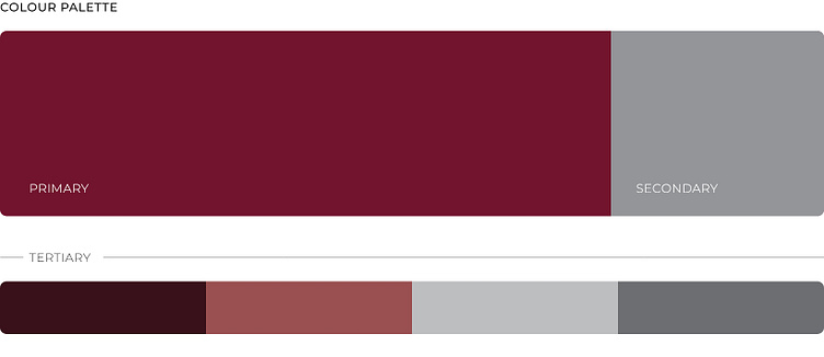
The colour is a warmer and more earthier red with depths that are inviting. The strong and established nature is easily adopted by this colour and the variants lend more visual synergy to various usages.
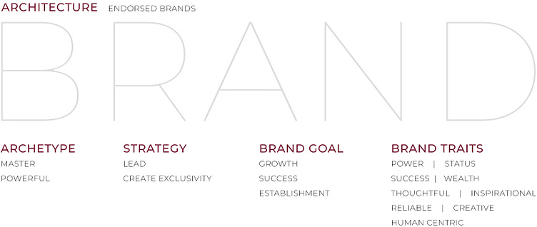
Goyal Group having multiple business verticals, was revisioned as a hybrid house of brands with its complex multi phased growth ventures, the rebranding had to be resilient to incorporate new avenues and alliances. We also created a prolific sub system that aligns with all products under the Goyal Group with focus on Realty with specific attention to positioning within that vertical.