Topo Poll

Alright guys, need your help here. Client and me are undecided atm.
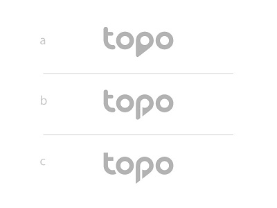
What's your say? a, b or c?
a)
Pros: Simplicity, balance, coherence, clear pin icon
Cons: Letter P not readable 100% at first glance rather in the whole sentence. Icon is not unique when looked at alone.
b)
Pros: Readability improved, letter P is clear, unique pin P icon
Cons: Slight clash with rounded-sharp elements, coherence and simplicity lowered
c)
Pros: Readability improved, letter P is clear, unique pin P icon
Cons: coherence and simplicity lowered