Bloom • Branding


We created Bloom as a solution to empower individuals and couples on their parenthood journey, connecting them with world-renowned fertility experts and specialized clinics worldwide through our AI-powered platform for tailored care and informed decisions.
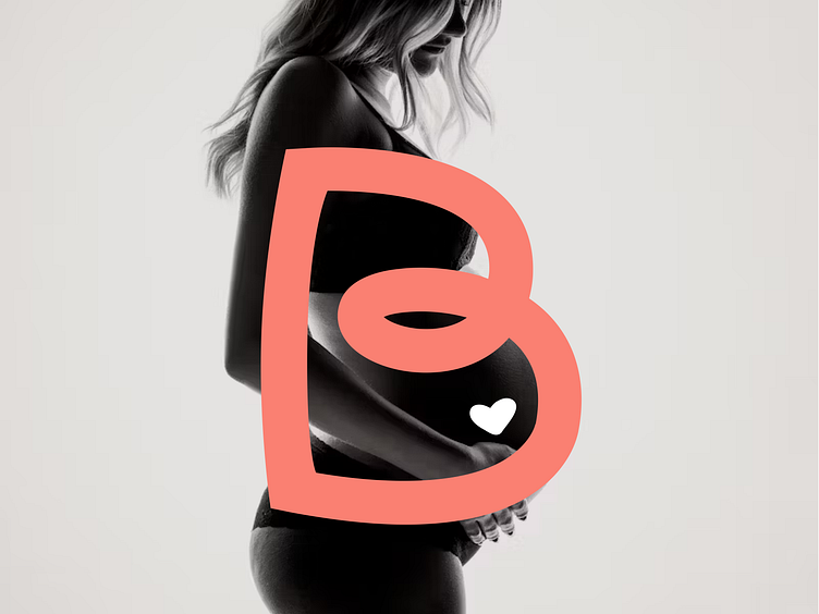
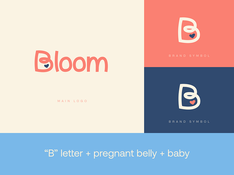
In this project, although we handle the entire interface, our focus for today is on the branding, which beautifully encapsulates the essence of our message. The 'B' in our logo is central, not only because it's the initial letter of 'Bloom,' but also due to its shape, symbolizing a pregnant belly and the form of life within. The heart inside represents the essence of life, the baby within that belly.
We are proud to work on a project as special and meaningful as Bloom 🌸
Check more of what we do at www.loka.com 💙