Waggo - Dog Walking App

Waggo is an app that allows dog owners to build a profile for their dogs, find reliable dog walkers in their area, and get in touch to schedule a walk.
I designed Waggo as part of the Dribbble Product Design Academy. We were given a project brief, met weekly with our cohorts to brainstorm and critique, and took individual approaches to assignments with feedback from our mentor.
00. Challenge
Dog owners sometimes need help walking their dogs and it can be difficult to find someone reliable.
01. Research
Identifying users
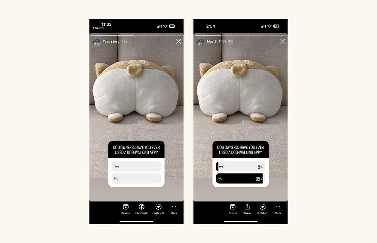
I posted a poll on my Instagram Story asking dog owners if they’ve ever used a dog-walking app. This helped identify dog owners and, moreover, those who might be interested in participating in my research.
Identifying user needs
After chatting with some of the poll respondents, I decided on three people to interview over the phone based on their experience with dog-walking apps:
Dorothy: Dog owner who knows about dog-walking apps, but doesn’t use them
Crystal: Former dog owner who has worked as a dog-walker through a dog-walking app
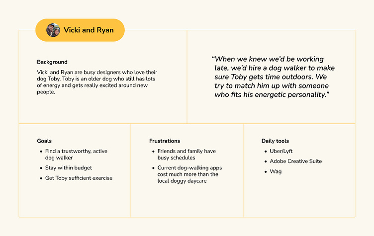
Vicki: Dog owner who has hired dog-walkers through dog-walking apps
From our conversations, I created a user persona to refer to while designing the app.
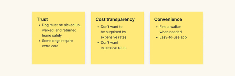
Our cohort discussed business goals, end user goals, and market research. We highlighted three key themes for the user: trust, cost transparency, and convenience.
02. Plan
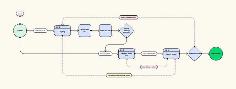
User flow
I mapped out the journeys a user might take to find and hire a dog-walker:
Standard journey: Sign up > Browse walkers
Discovery journey: Browser walkers > Sign up
By providing the option to explore the app before committing any personal details, I hope to establish trust and provide cost transparency.
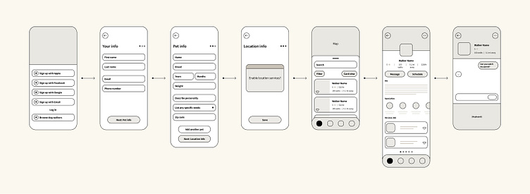
Wireframes
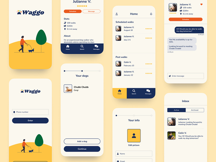
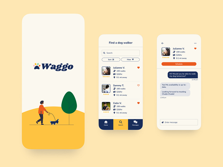
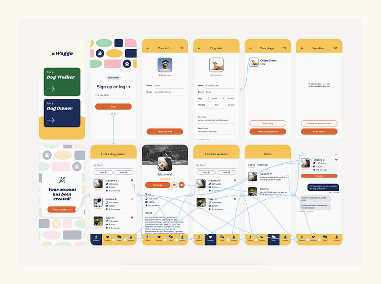
Next, I created wireframes for key app screens: the sign up flow, dog walker search, dog walker profile, and messaging functionality.
03. Design
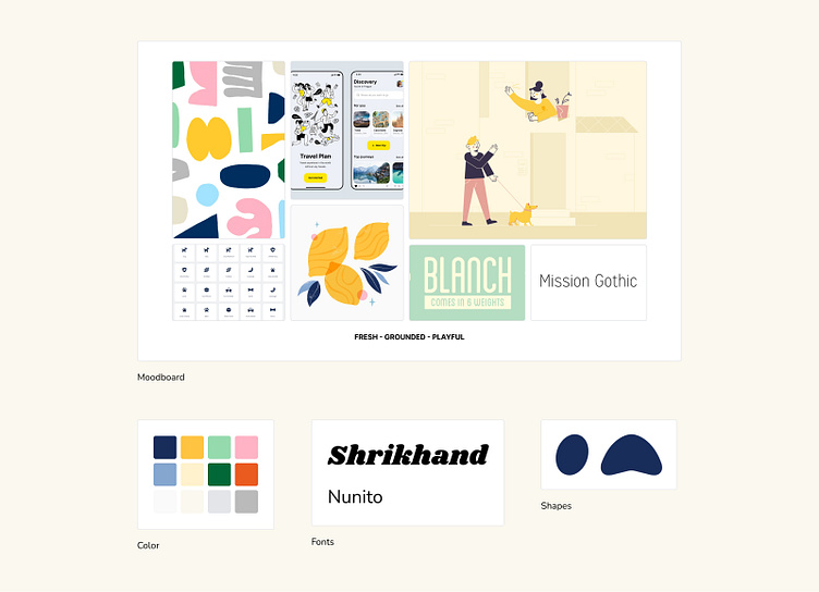
Brand
During the research phase, I found that most apps and services in the pet industry use saturated primary colors and bold accent colors. Typography is fairly basic and imagery usually consists of stock and studio photography.
To help my app stand out, I decided on a visual design that is bright, fresh, and playful. I want my app to exude the same level of friendliness and trust that a dog owner might feel when they think of a friend or family member who can walk their dog.
Prototype
My high-fidelity prototype went through multiple rounds of testing and design updates based on user feedback.
Feedback fell into several categories:
Visual design
Font choices and the extensive color palette need to be refined to match the product tone and goals.
Focal point
Each screen contains lots of elements, making it overwhelming and difficult for the user to know where to look.
Prototype usability
Incomplete form states, missing transition screens, a lack of labels on input fields, and disabled or unpredictable back buttons led to confusion.
04. Conclusion
I learned about conducting unbiased, consistent user research; the impact that details can have on the overall user testing experience; and the amount of thought that goes into even seemingly simple features.
I also learned how to prioritize features based on impact, timeline, and resources in order to provide weekly design updates.
Initially, I was skeptical about the usefulness behind designing yet another dog-walking app, but by the end of the project I realized it's possible to build on existing solutions with fresh perspectives.