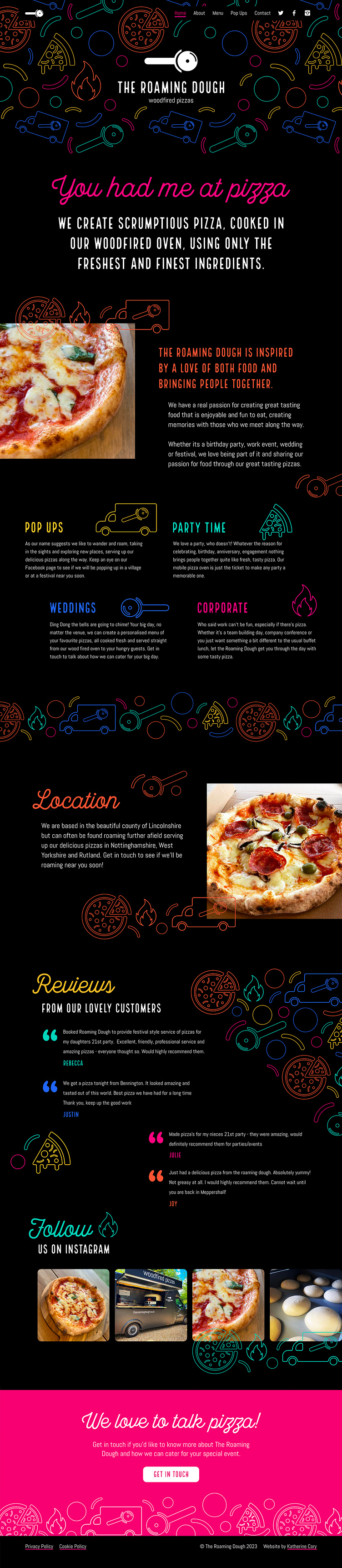
The Roaming Dough Homepage

Case study - https://medium.com/p/35261db84513
Sadly, the budget ran out for this rebrand and I was unable to redesign the homepage but this is what I had in mind for the website.
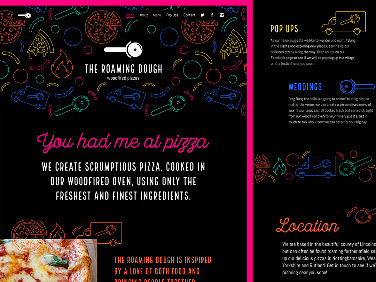
I really want to push the design in terms of using the icons in unexpected ways and trying and create a really exciting website that brought the rebrand to life. I wanted to use the pop of colours throughout and felt it was important to include the photography of the pizza to show the business was the real deal!