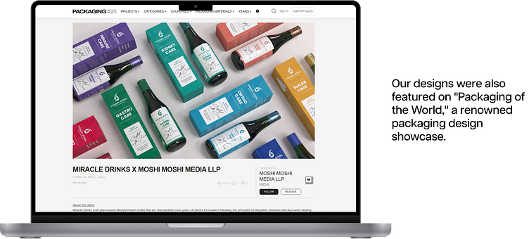
Miracle Drinks | Purpose Oriented Packaging


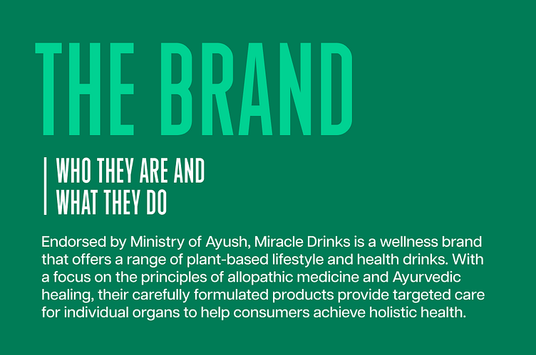
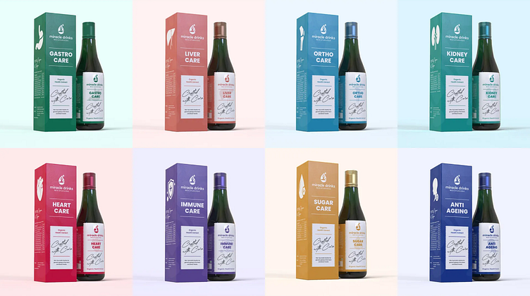
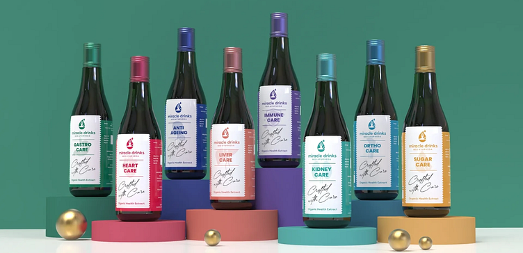
The brand's commitment to natural ingredients and absence of artificial preservatives makes their products a healthy and sustainable option for those looking to improve their lifestyle and overall well-being. With years of expertise and research, Miracle Drinks has created 8 products that work together to address a variety of lifestyle health issues.
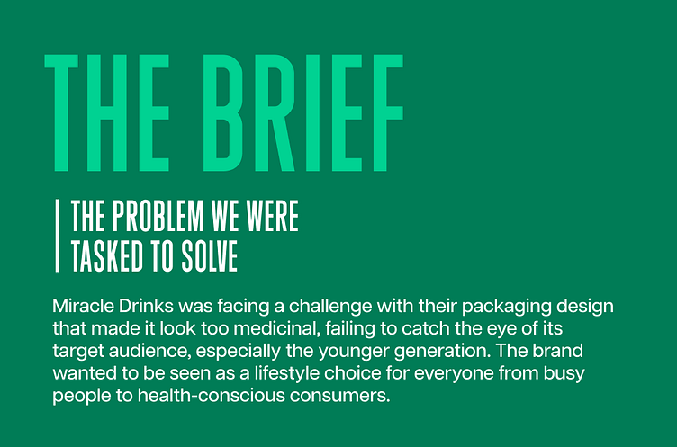
The brief came with a constraint that the existing bottle structure and color cannot be changed. Our task was to come up with a new design that would align with the brand's values and appeal to its target audience, while still keeping the same bottle structure and color.
We also exposed them to various visual stimuli and gauged their reactions. In addition to primary research, we also conducted secondary research analyzing packaging and consumer trends, along with competitor research.

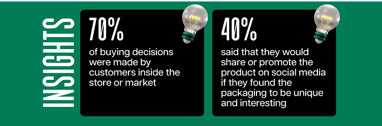
In fact, 40% of the consumers we surveyed said that they would share or promote the product on social media if they found the packaging to be unique and interesting. One of our respondents shared that reaching out for medicinal products creates a sense of fear in their minds regarding their health.
We also discovered that a purpose-oriented packaging design that clearly explained the benefits of the product would help consumers better understand the brand's value proposition, differentiating it from other brands in the market.
Additionally, our research also revealed that only a small percentage of the younger generation were familiar with Ayurveda, the foundation of Miracle Drinks. This insight was essential in guiding our design approach, as we aimed to make the brand more appealing to this demographic

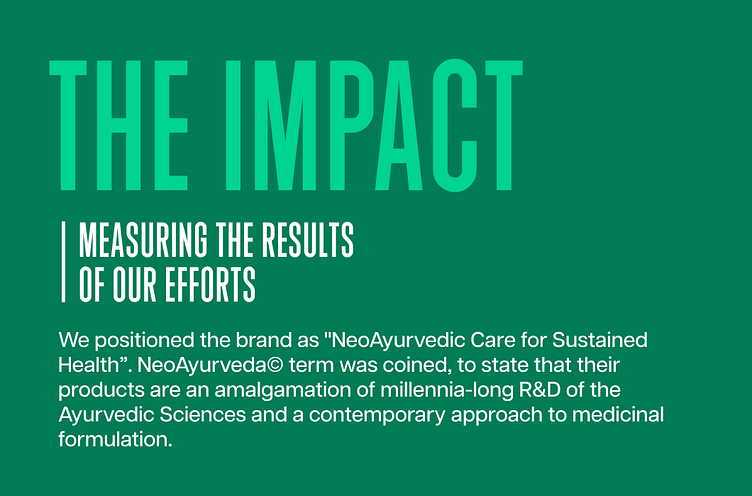
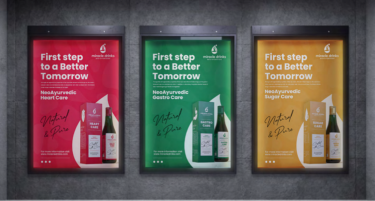
Prevention is better than cure, after all. Ayurveda is viewed as a slow & old treatment. By highlighting the amalgamation of old + contemporary formulation, we wish to bring back the trust in our lost sciences – making the brand more approachable, especially among the young consumers.
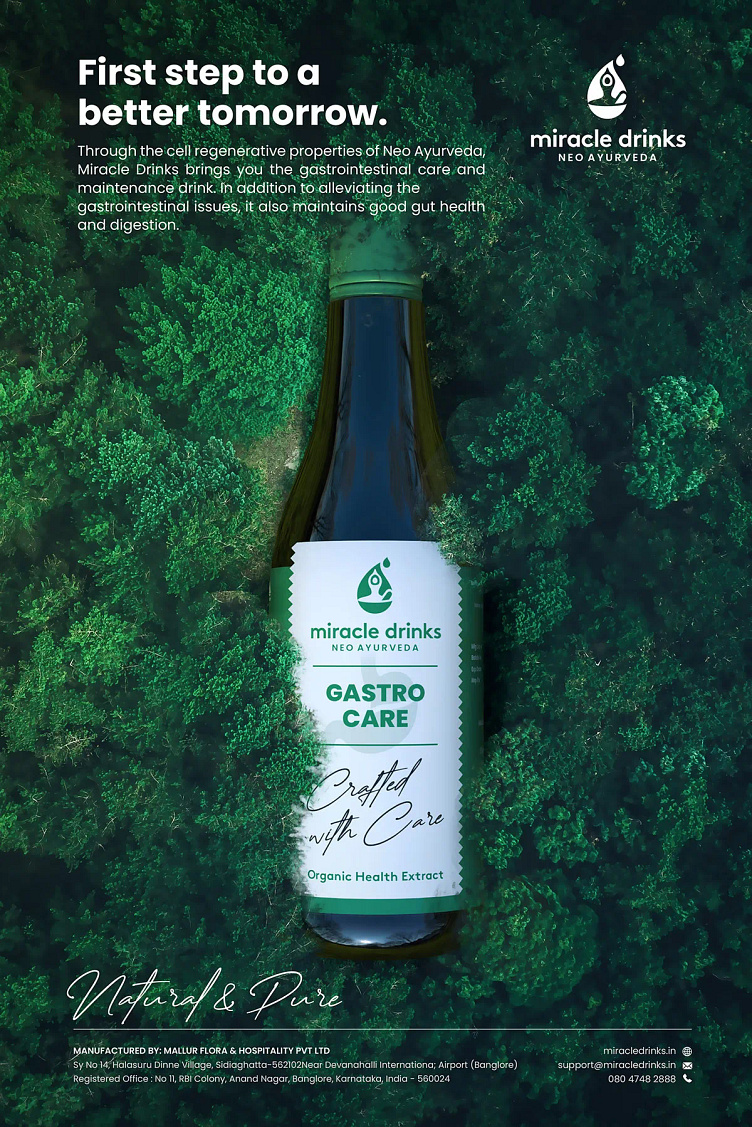
We took our valuable research insights into account and designed the packaging in a way that created a connection with the consumer, rather than generating fear or discomfort. To appeal to younger consumers, the packaging design of Miracle Drinks was created as a lifestyle product suitable for everyday use. The purpose of each product was highlighted by displaying its benefit and color.
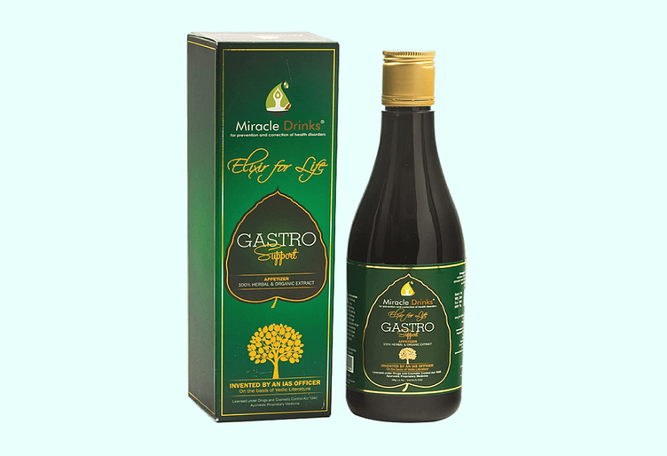
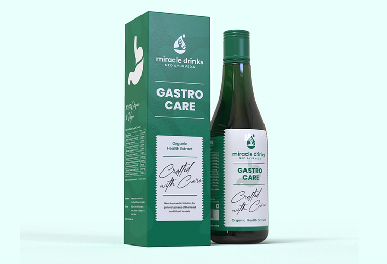
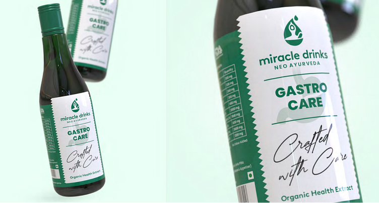
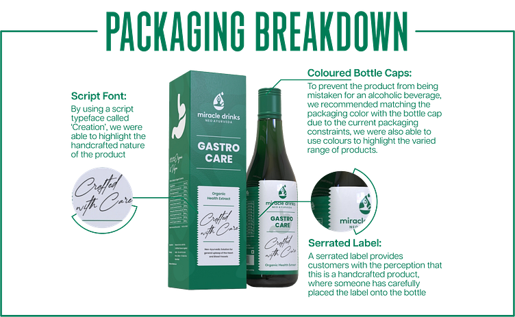
The founder of the company, Mr. SM Raju, IAS (Retd.), developed the product out of personal necessity to address chronic illnesses. The packaging design also highlighted the handcrafted nature of the product by using a script typeface called 'Creation.' To prevent the product from being mistaken for an alcoholic beverage, we recommended matching the packaging color with the bottle cap due to the current packaging constraints.
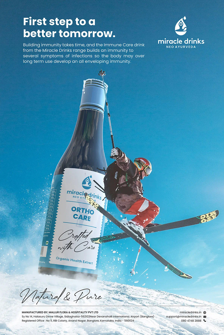
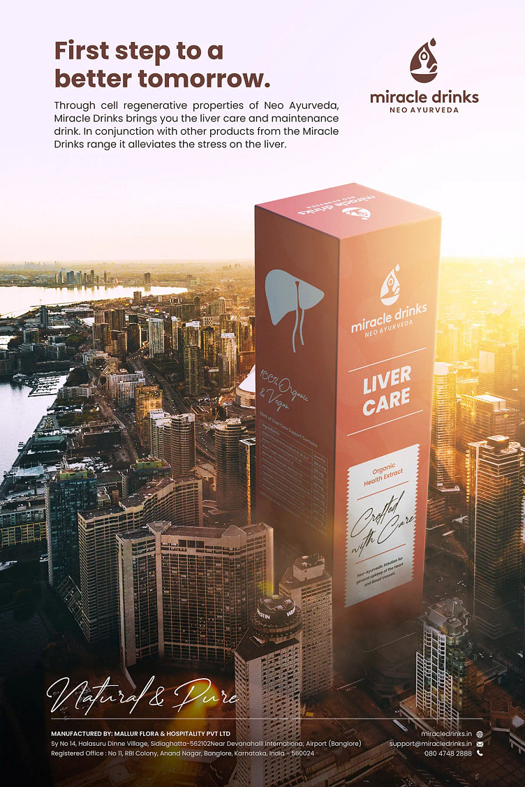
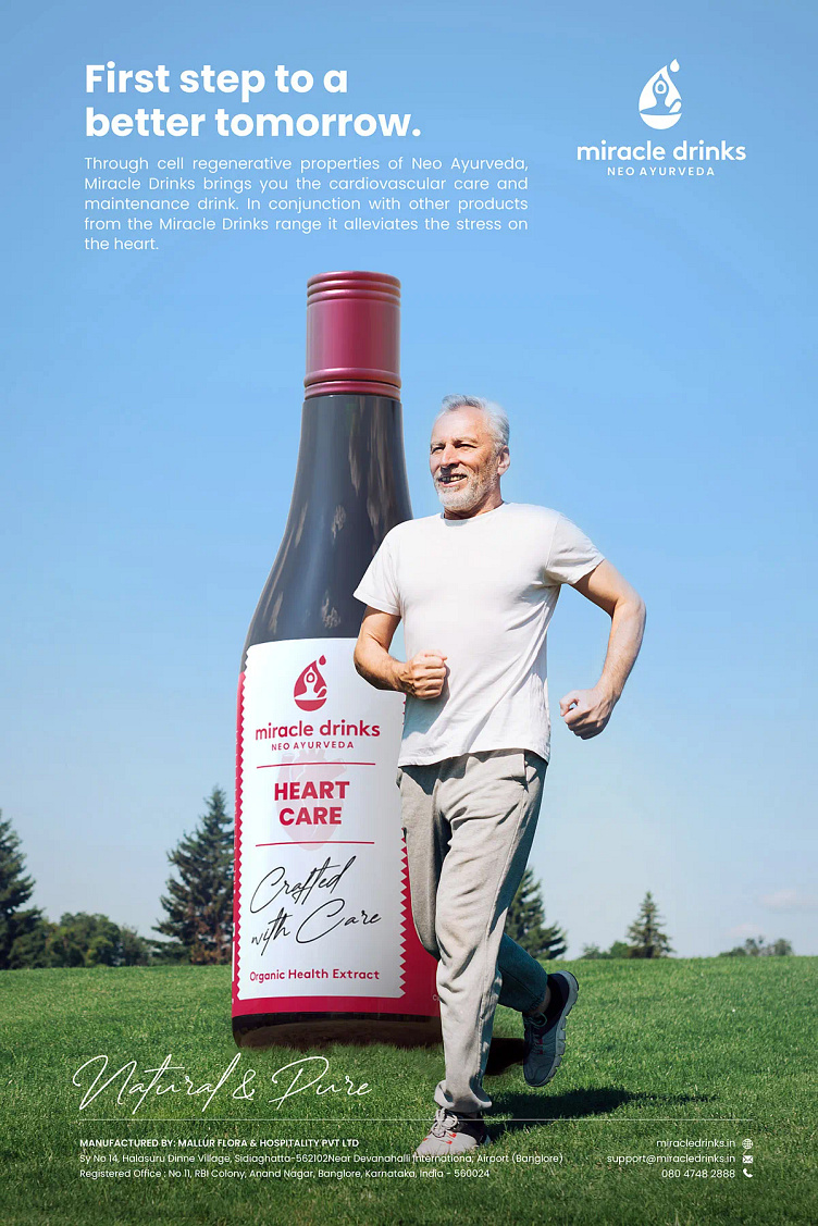
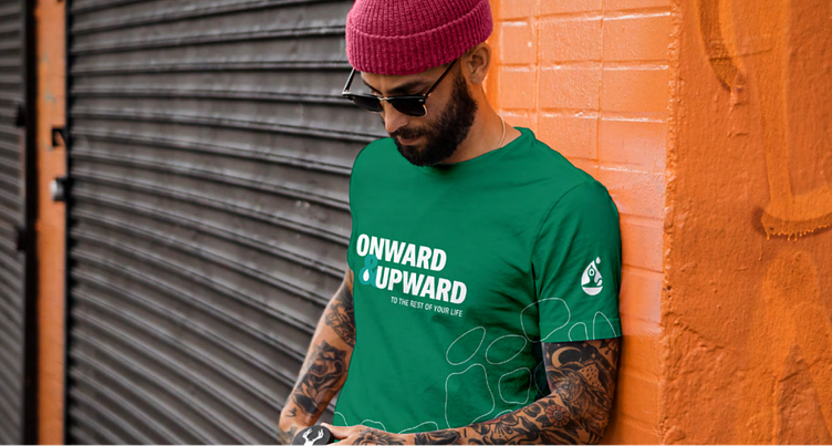
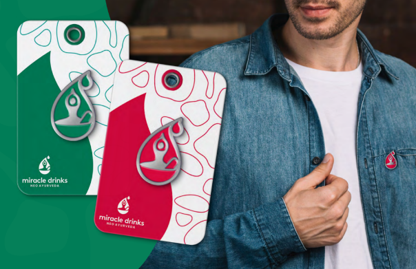
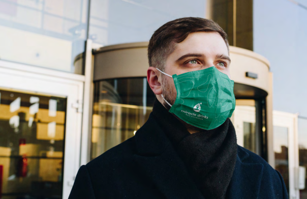
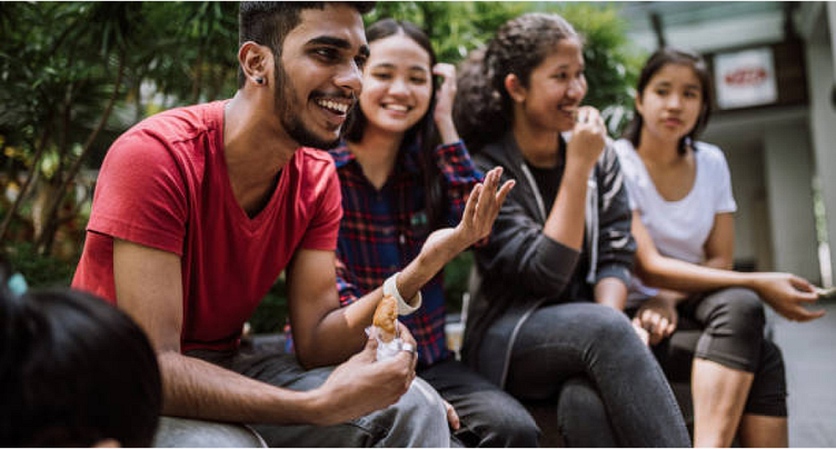
The packaging design was a critical element in the overall marketing strategy. To appeal to the younger consumers and make the product part of their everyday life, we used a lifestyle-oriented approach. We also utilized photo manipulation techniques to seamlessly integrate the product within relatable contexts for the target audience, such as busy city life, holiday adventures, and more. This approach not only grabs attention but also generates curiosity among consumers, encouraging them to learn more about the brand.