Silo Case Study
Silo is a cloud software platform built to optimize purchasing, selling, inventory management, vendor/customer management, accounting, reporting, packing, and logistics. They are on a mission to fundamentally transform the way food is bought, sold and distributed, revolutionizing the wholesale produce supply chain through technology.
The existing food system is static, slow to change, and lacks the data and intelligence of modern platforms. In 2018 Ashton Braun and Antonio Bustamante founded Silo because they wanted to equip everyone involved in the buying, selling, and growing of food with the same adaptive technology as other modern industries. And it turns out, incredible things happen when everything is connected. Silo seamlessly brings together real-time data, inventory management, and financial services into one intelligent platform that boosts efficiency while cutting costs and reducing waste in all forms and in all parts of the process.
In 2021 Gold Front approached us to help them work in the rebranding and new visual identity design for Silo.
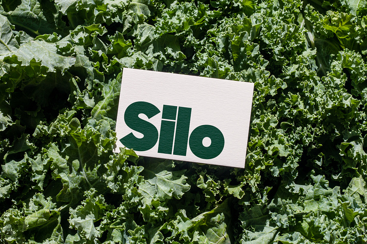
We ended up with a new tight geometric logotype that is defined by its bold character, mirroring the impact they wish to make in the world. We also created a standalone mark based on the letter shapes of the logo, that nods to the notion of silo fill levels.
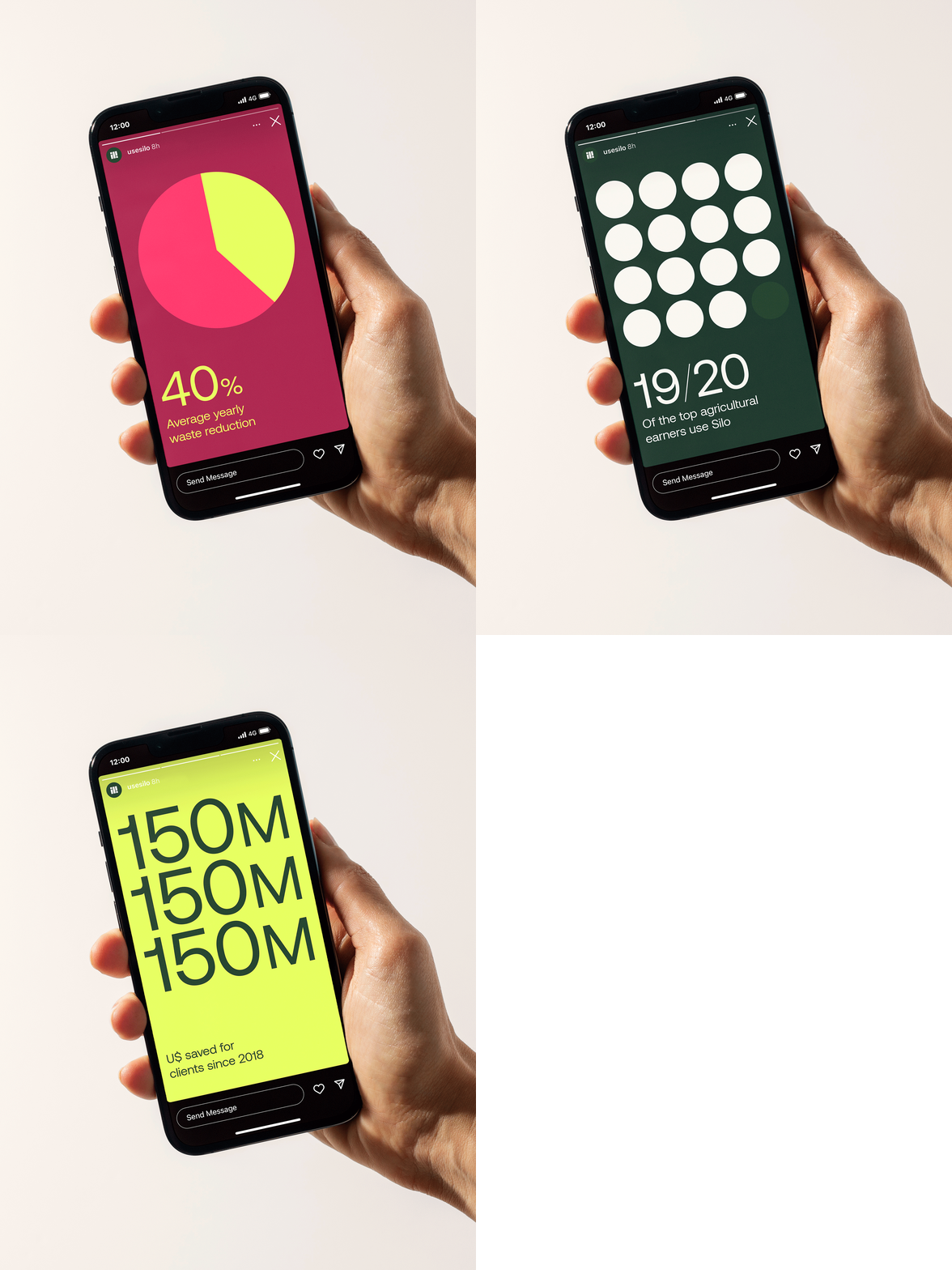
A more expansive palette of edible colors was introduced to offer a wider range of expression with various tones and vibrancies.
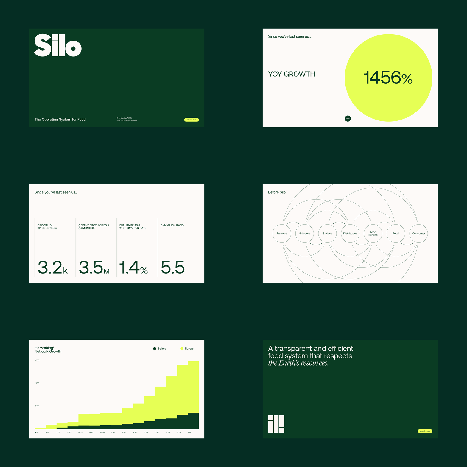
The typographic system pairs a geometric neo-grotesk with a modern serif of warm curves and sharp details.
With the photography, we aimed to illustrate wholesale food patterns in engaging and visually-pleasing ways. Concepts of order (systematizing), distribution (layout) and stock (volume) are shown through repetition, which is also present as a device in typographic layouts and animations.
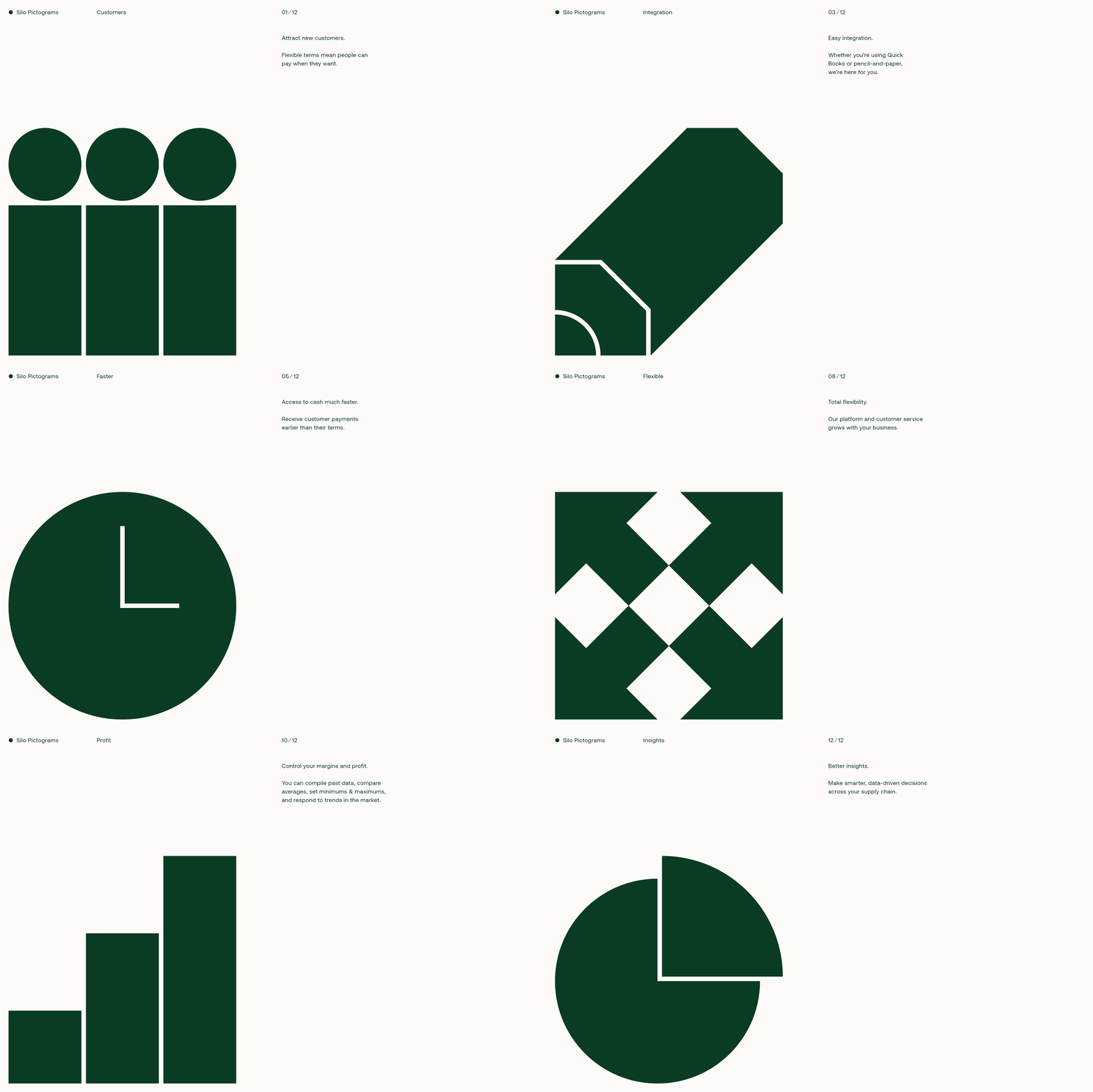
We developed a pictogram system grounded on the mark configuration, replicating its blocky feel using bold shapes and narrow counterforms.
Brand Studio: Gold Front
Creative Direction: Josh Lowman, Jonathan Haggard, Emily Yurko
Art Direction & Design: Asís
Client: Silo
Food Photography Photography: Magalí Polverino
Food Styling: Loli Braga Menéndez


