Propology - Logo Concept 3

Propology is equalizing access to high-quality real estate data.
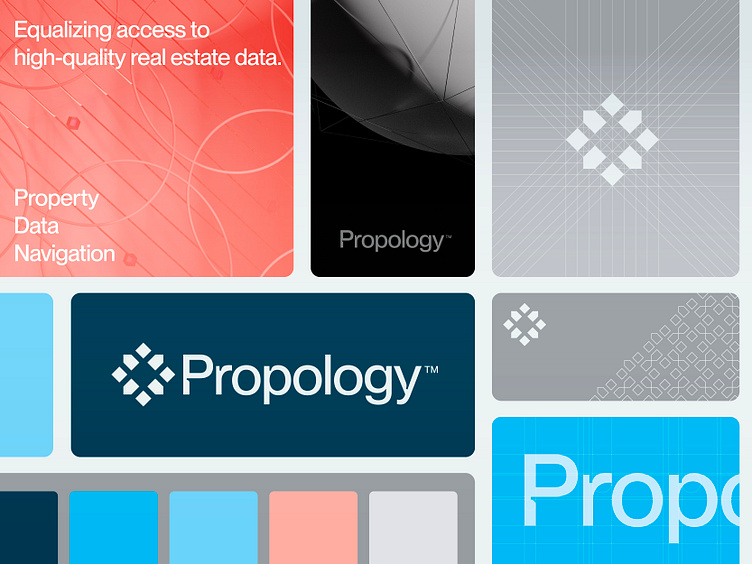
Returning to the initial concept, I decided to refine it further after receiving feedback from my client. Removing the inner cube makes the mark feel more open and airy while retaining its original concept. I also delved deeper into the typography, as my client wanted a creative word mark next to a strong symbol. With the addition of colors and patterns, this brand identity is growing on me rapidly.
Happy to hear your thoughts and possible points of feedback.
Presentation style inspired by Ramotion.
Have a great Friday everyone!
Jeroen
___________________________________________________________________________________
___________________________________________________________________________________
Let's work together and elevate your brand!
Feel free to reach out via Dribbble DM or E-mail:
👉 info@jeroenvaneerden.nl
💼 Connect with me on LinkedIn / Read my Client Recommendations
🎬 Check my YouTube for Logo Tutorials / Learn Logo Design
🔗 Follow me on Instagram / See BTS and New Content
💬 Tweet with me
