Propology - Logo Concept 2

Propology is equalizing access to high-quality real estate data.
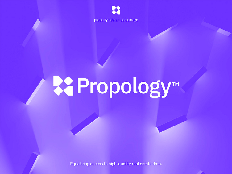
The second concept incorporates arrows, which can be interpreted as abstract properties, as well as cubes representing data and percentages that emphasize the analytical aspect of this intelligent tool. The design allows for scalability and mobility in retrieving the desired data and information in the real estate industry. I aimed for a more abstract style rather than a flowery appearance, which the previous concept had somewhat resembled.
Happy to hear your thoughts and possible points of feedback.
___________________________________________________________________________________
___________________________________________________________________________________
Let's work together and elevate your brand!
Feel free to reach out via Dribbble DM or E-mail:
👉 info@jeroenvaneerden.nl
💼 Connect with me on LinkedIn / Read my Client Recommendations
🎬 Check my YouTube for Logo Tutorials / Learn Logo Design
🔗 Follow me on Instagram / See BTS and New Content
💬 Tweet with me
