Rebranding Identity for Agency


Hi everyone! 👋
You might know spellon is a digital agency of professional and hearty designers, and developers where any business owner could get all the design work done for their business growth. Here, I am exiting to share our reason for rebranding, what was the main problem, the working process and lots of things.
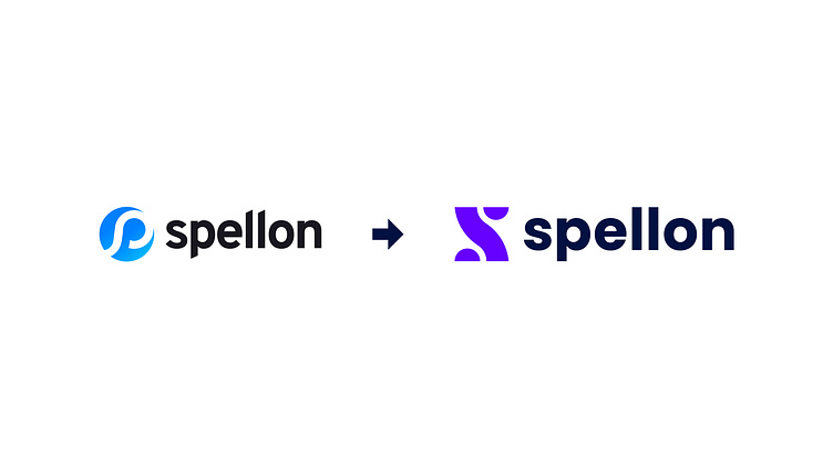
After completing a competitor analysis, I came up with an understanding that most of them use simple geometric shapes full of different angles in their brand identity. I found the great four rules of great logo design should be appropriate, distinctive, memorable, and simple. Then I apply the that's in our identity. And now I think they have a perfect identity better than wasn't previously. What do you think?
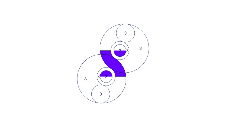
The story behind the mark is simple. I kept the first letter of the spell on, the path, infinite journey of spellon, happy face, bold, and connection between the client and them. Also, the mark was created using by golden ratio rule. The sound might be interesting right?