Humbo preferences screens

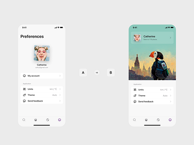
Two options for Preferences / Account tab of the world exploration app I'm working on, Humbo.
You can let me what do you think about them and which one is better in your view!
After many variations I am now leaning towards the simpler version A, as it feels more natural, simpler to grasp what is going on without thinking. I quite like the travel puffin bird visually, but I just can't answer the question why does it need to be on this screen taking up space. Other than being pretty.
I'm making iOS version of Humbo right now, but the web app is already live on humbo.com