


Worlds in our hands

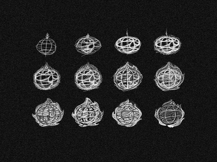
I've made some sketches to find the most interesting combination between the elements, maybe it looks too complex now but on the further steps I'll try to solve this initial issue
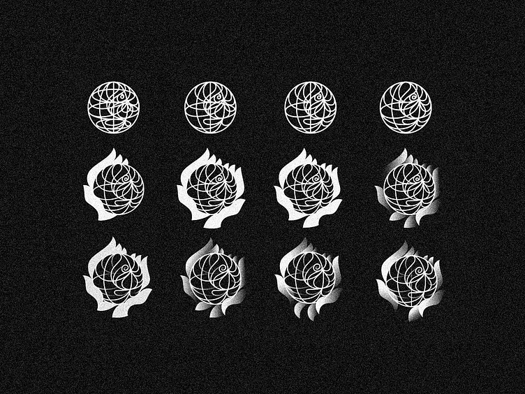
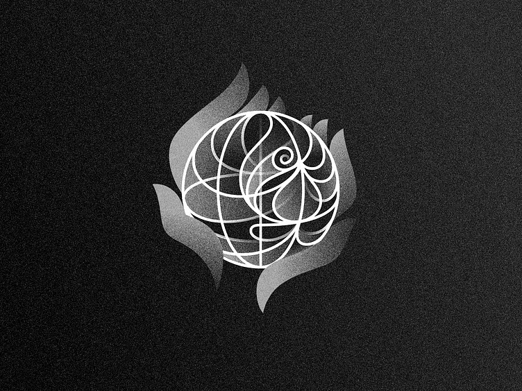
Here I've made a refinement of the best sketch, I've tried my best to make everthing visible in just one color; had some trouble to pais both hands and the globe still making evident the bird inside the globe
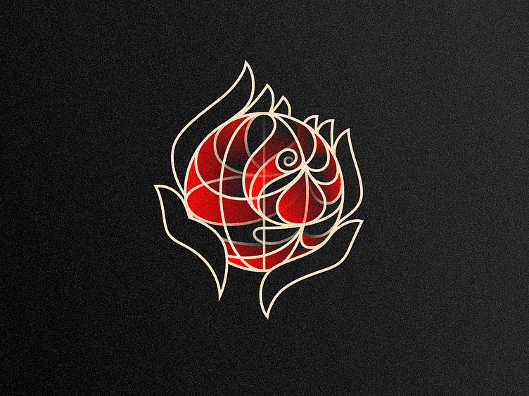
At the vector step I liked the hands as solid shapes, but it looked kind of heavy compared with the linestyle inside of the symbol, so I've added some gradients that seems to be interesting to add the "flame" idea, as if it's something warm and hard to grab, volatile...
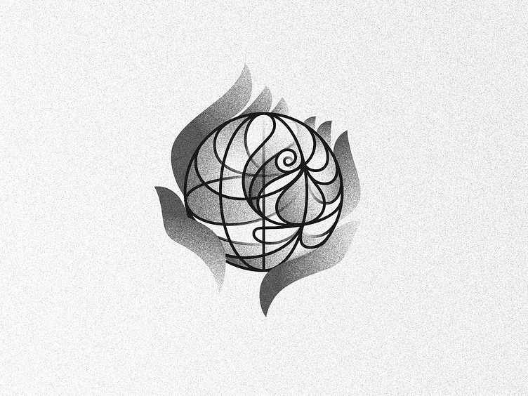
Not perfectly traslatable to one color, but keeping the gradient seems to be nice in this case, and I consider the inner part the most important to be understood here
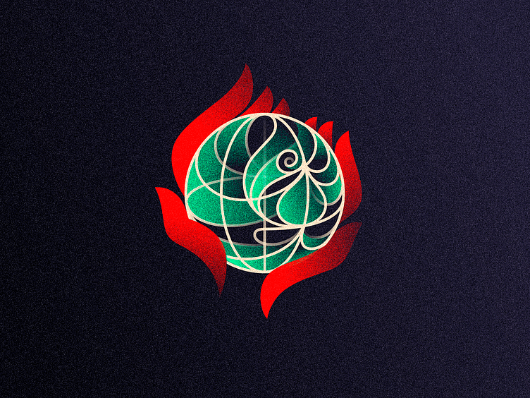
I think the all in red is best for it simplicity, but I'd like to see it with separated colors to be clear the idea of each element here, don't know if green is the best combo but I like a lot the idea of "a green bird" paired with the globe concept
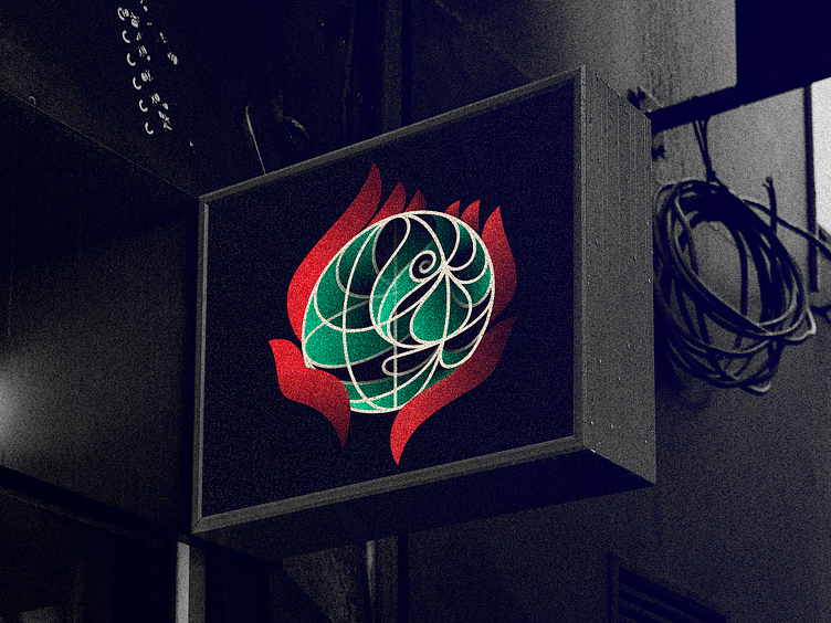
I think this one is my favorite version, this logo look really interesting in negative colors and I think each element have the perfect balance so far to me
Anyways, the "wireframe" version look a bit busy to me, so I kept the gradients for the bird, here it seems more like a phoenix (or a fancy parrot, lol), just a optional version that would look nice in green or any other colors
I hope you enjoyed this little journey through the creative process with me, feel free for make questions or any critiques on the comments, feedback is always welcome, I'm still learning and love to know what you people have to say!
I'm sure you have something nice to add :)
Also I'm available for new projects, so feel free for ask me!
Need a logo, illustration or other crazy stuff? Email me now :)
Follow & Connect!