Wix's Password Strength Indicator

In this case study we’ll look at how adding a password strength indicator helped us increased our users’ passwords strength by 26%, as well as the UX dilemmas we encountered along the way to finding the best solution.
The full case study can be found on Medium.
Background & Motivation
Many aspects of our lives are managed digitally. Whether it’s our social life or running our business, all of these products have one thing in common — they all require a password to log in. We’re asked to create new passwords all the time and, as a result, some of us tend to underestimate their importance.
Here at Wix, this caused a problem that can be easily described: the passwords of our users were not secure enough. As our users’ security is a top priority, we decided to change that.
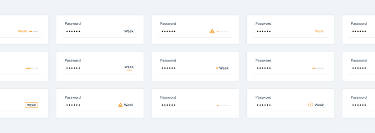
To motivate our users to create stronger passwords and be more aware of security, we decided to show them a password strength indicator when creating their passwords. The indicator includes suggestions and a color-coded strength indicator, advising the users whether the password they’re creating is weak, average, good, or strong.
Challenges
Our biggest challenge was balancing between two different goals. One goal was improving the strength of our users’ passwords, the other was maintaining the amount of successful registrations. We had to find the balance between making the strength indicator an essential part of the registration process but also not cause friction to the signup and account creation process.
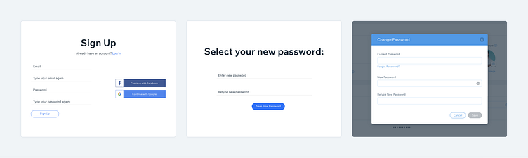
We also had to take into account that the password indicator will appear in all sorts of different places in the system, where there is a password field — such as sign up, reset password and change password pages. Therefore, it should be able to be displayed on different page layouts and screen sizes and be compatible with several design systems.
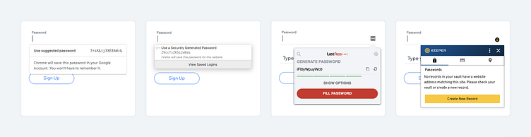
During our research, we discovered that dealing with password managers would also present a challenge. Whether it’s a pre-installed plugin or the browser password suggestion, it’s usually a window that pops up exactly at the time and place where we initially wanted to display the indication.
Ideation
At this point, I divided the product into smaller parts and explored all kinds of directions for each part. To think outside the box and come up with creative solutions, I gathered a lot of inspiration, references and ideas, and turned them into quick sketches. I tried to keep an open mind and not discard any option, even if it did not seem relevant at first.
These were the main dilemmas I had to solve, some were tackled in the wireframe stage and some in the UI stage.
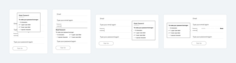
Placing the indicator
When I explored the options for the indicator location I had to take into account different layouts and additional elements on the screen like the password managers mentioned above. I tried to place it all around the field, above, below and on the sides. I tried it as a popover and as part of the page. I had a few versions where all the elements appear together and other versions where the indication itself is separate from the conditions and so on.
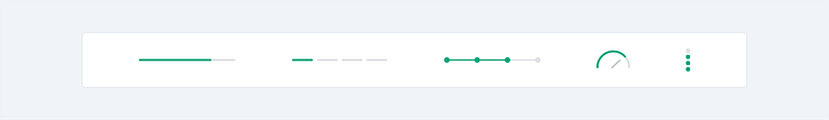
Providing positive feedback
I aimed to give the user a sense of progress and create a feedback loop — an immediate indication for every action they performed. For this, I examined various types of bars and meters. Another benefit the users gain here is a certainty about what remains to be done to achieve a strong password.
The second element that was an opportunity to provide a positive feedback to the user was the mark of a completion. But this one was a bit tricky — on the one hand I wanted to give a noticeable and motivating indication of the completed task (e.g. using upper and lower case letters) and on the other hand, not to lose focus from the remaining tasks (e.g. using a symbol), because that’s where I wanted the user’s attention.
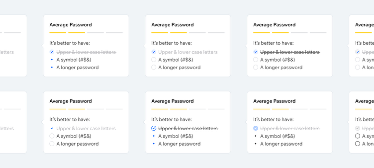
Encouraging without mandating
Another aspect of this feature was a small indication that appears after the user has left the password field. Although it’s a small element, it wasn’t easy to crack. I needed to strike the right balance between letting the user understand they can continue, but also encouraging them to return and create a stronger password. Lots of options were examined including changes of color, text, visual representation, icons and more. Some of the options were highly visible and even looked like error indicators, which may have caused confusion for the user, while others were less prominent and could even be overlooked.
Metrics & Outcomes
Although every feature that we roll out goes through a lot of internal iterations, the real answer to whether or not it answers the goal is through an A/B test. We evaluated the efficiency of the password strength indicator by displaying it to 2,000,000 people who signed up to Wix, half of them received the indicator, and half didn’t. By analyzing the data from the password strength indicator and user’s interaction during password creation, we saw a great increase of users creating stronger passwords than they would have done otherwise.
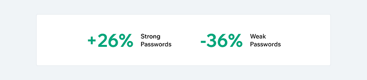
Our main defensive KPIs (sign-up success and premium purchases), remained the same.
The number of strong passwords increased by 26% and the number of weak passwords decreased by 36%.
We can happily say that we managed to greatly improve our user’s security by helping them create stronger passwords, and we did this without disturbing our users’ experience.
After the test, we eventually launched the feature to all our users. You can try it for yourself by signing up on Wix.com.
You can read the full case study on Medium.