Emily Bazalgette Round Two


Again, I've included the second round concepts in my first three images and have shown how I got there in the other images.
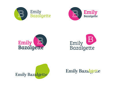
We both felt Emily's name looked too harsh in a bold sans serif so I explored friendly serif typefaces instead. We wanted to focus more on the ‘g’, ‘z’, ‘y’ and double ‘tt’ because they’re quite an unusual combination! I also felt Emily's name was balanced best over two lines and explored the circular design further as Emily was a fan of this from the first round.