The Outdoorsy Type Logo


The Outdoorsy Type is for like minded people wanting to get active outdoors in Suffolk and when they first launched they created themselves a logo in Canva but as the group grew they wanted an a new logo that was more unique to them.
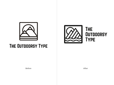
I wanted to create an iteration of the design so not to confuse the current audience but also improve on certain elements. The vertical lines in the original logo represented the sea so I wanted to make that more obvious and use waves instead. I used a heavier frame to differentiate between the border and the land and sea. I introduced diagonal lines to represent the mountains and move away from snow covered mountains (there's not many snowy mountains in Suffolk!) as well as contrast against the curvy waves. I also softened up the typography.
I did play around with adding trees but felt it over complicated the design and was given free rein to alter the sun but felt the sun behind the mountains worked best.
This was a relatively small project but sometimes the smallest pieces of work can create quite a huge improvement.