Harmonia

To give a little background, Nexxus is a suite of apps for the Life Sciences industry. Our new logo marks are based on the classic hexagon cell shape.
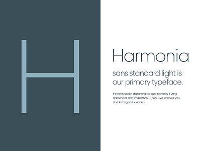
We picked Harmonia Sans as our primary font because we were looking for a geometric sans to complement our logo marks. Harmonia Sans is great, it forms reminded us of classic geometric fonts like Futura and ITC Avant Garde Gothic, only updated a bit and it works well online.
If you want to nerd out more on Harmonia Sans, here’s a link: http://www.fonts.com/font/monotype/harmonia-sans#product_top