


Fantastical hero redesign

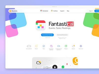

The Fantastical app is one of my favorites. That said, the Fantastical marketing site has great concepts, but pretty lackluster execution.
Cycle between my redesign and their original design in the carousel above, then read more about the changes I made:
• To start with, the excellent logo isn't set on proper pixel boundaries, so it's blurry
• Then, the decorative background app icons aren't the proper iOS shape, and are set asymmetrically, which makes the page feel unbalanced. Also they're far too dark and attract too much attention, as well as having muddy shadows
• The navigation is extremely tight, both due to the narrow page-level grid, and due to be sticky to the top with no internal padding. Moreover, it has no shadow to distinguish itself from the page
• For the subhead, "Events. Tasks. Meetings." it appears the text-image was stretched horizontally, for no apparent reason. If the icon, header, subhead lockup are made asymmetric, it balances them better, while increasing the font size makes the page seem more confident
• The App Store and Design Award images are now 2 and 6 years out of date, and can be removed, or thrown way down the landing page
• The icons desperately need redrawing from an execution standpoint, but offered a great conceptual starting point to go off