Càphê Roasters - Coffee Packaging


After months of back and forth with production trying to get everything jussssst right I'm finally hyped to show this packaging off. So much love and care has gone into every detail of this piece. We've got – rainbow metallic gold foil, a dragon guarding the pull tab, colors on colors, a squeeze and sniff valve, an abstracted ingredient sticker system, you name it.
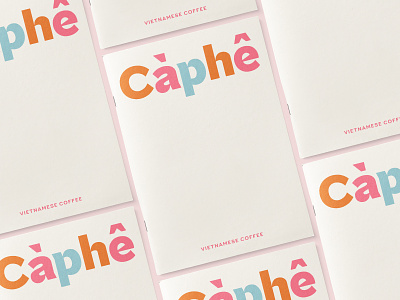
"We created a packaging program that reflects this vision of a more inclusive, more open coffee community. Inspired by the colorful streets of Hanoi, the new system embraces a broad spectrum of hues. Each variety has its own colorway and playful forms, so customers can spot their favorite right off the shelf. The sides are the best part—abstracted from the terraced rice fields of Sapa, the pattern references the beautiful landscapes of Vietnam while adding a surprising pop of color to the entire system." - Rong Xiang