Rebranding Getsafe


Since its foundation in 2015, Getsafe has grown up a lot. Together with DesignStudio, we now have renewed our brand image and sharpened our vision. With a new logo, a new design and a new voice, Getsafe is positioning itself as a digital insurance provider for a new generation of insurance customers throughout Europe. Using technology and machine learning, the company offers digital insurance products in all lines of business – property, health and life.
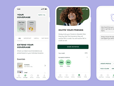
The Getsafe app is available to customers 24/7 and 365 days a year, allowing them to file claims or change their coverage in real time.
Embracing life with all its risks – that is the underlying concept of the new brand. Because life just happens! Our approach is to accept accidents and embrace them as part of day-to-day life. Simple and to the point, with our visual identity concept we want to reflect everyday situations that can go wrong, but should not faze you. This concept applies to every single piece of the new brand.
Together with DesignStudio, we created a visual identity that can adapt to different moments. The colour palette is luminous and eye-popping for outdoor ads, but more muted for the website and digital experience. Likewise, the tone of voice dials up and down. Big headlines have attitude and terms and conditions provide clarity. The colour palette also represents the before and after of the accident; each colour is available in a positive, light variant and an enriched contrasting colour.
A typeface developed especially for Getsafe emphasises the balancing act between crisis and a positive attitude towards life. The new typeface is a form of the font Adieu that includes “accidental” elements. This is only used for negative words and situations. However, it never stands alone, but always together with the unblemished Adieu – representative of the positive side both visually and literally. This is our way of showing that we make the best out of every crisis. Even the logo itself includes an accident, with a “dent” in the letter G.
Like this, the new brand reflects this concept of being forward-looking and positive, but it does not stop at words and images. It symbolises the complete reorientation of insurance. It embodies freedom – not only for customers. Getsafe's new brand is designed to grow and change, just as the company has since its foundation.