Eco X-Pert Group Logo Design

Hello everyone!
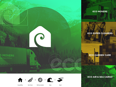
Here you can find the meaning behind this logomark. As this is a New Zealand company, I wanted to give it an authentic meaning.
This symbol created by combining many shapes together to give it a good deep meaning. The main part of the logo is the negative space spiral shape. This shape inspired by fern frond and New Zealand Koru symbol. It also represents ocean waves and land roads, as they have services like sea cargo and house movings.
Right side you can find wordmark logos for all their services.
Check the full case study on Behance
if you enjoy, hit the like button to show your ♥
See you in next shot. :) #cheers
Available for any branding projects.