


Shoutt App - Profile/Messages Side Nav

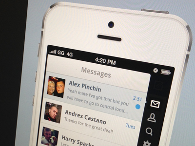
Different approach to a side bar. This UX works for us as this section is not the primary part of the app, therefore it didin't make sense for us to have a typical tab bar. It also future proofs it for adding more views later on, which will no doubt be the case :) Icons by Victor Erixon.