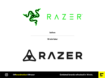
BMF! #04 / Razer
Razer's current logo is ugly and outdated. It is unbalanced, not modern and looks like an awkward tribal tattoo. I have always been disgusted by the brand only because of that big ugly « 3 snakes » element that would pop-up on my laptop.
I redesigned the font based on Montserrat and just kept the A that in my opinion is in representative of the Razer iconography. I used the A shape to create the logo icon, bringing it back to something more geometrical and technological.
FULL POST
www.instagram.com/p/B8g2sr7hgY_
BRAND ME FAST!
www.instagram.com/brandmefast
@brandmefast
bmf!
brand
brandidentity
branding
brandmefast
identity
logo
logodesigner
logoresponsive
logotypes
razer
razerblade
razergaming
rebranding
redesign
responsive
uidesign
View all tags
Posted on
Feb 26, 2020
More by BRAND ME FAST! View profile
Like

