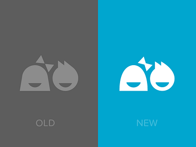
Working on an update to the Notabli logo. We love our mark, but it's showing some signs of age. The original was optimized and pixel-fitted for viewing as an app icon on a non-retina iPhone, hence some of the harsh angles. The refreshed ...
We're working hard at the next version of Notabli, as well as a massively improved web app. The new UI will include a lot more illustrations.
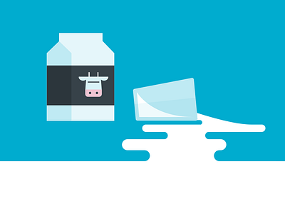
I've been working with @Alli Berry on refining our style and coming up with fun metaphors. We...
I just realized that I've been neglecting my Dribbble feed!
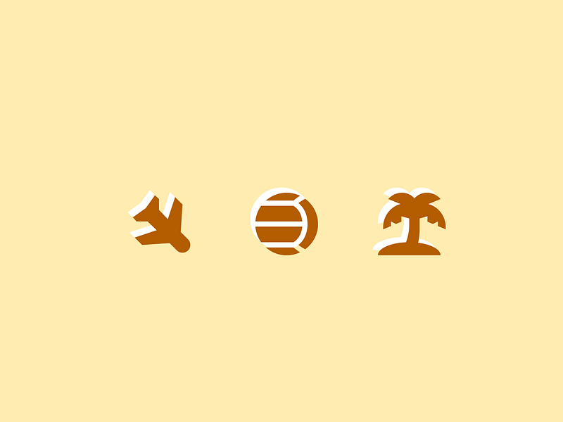
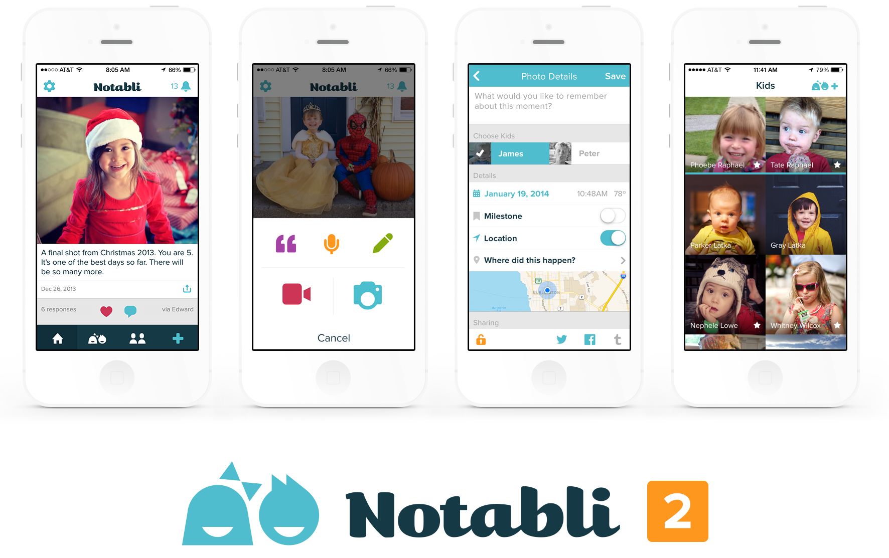
We're getting close to launching a new version of Notabli, and I think that means it's time to start sharing some progress and some sneak peeks! First up are some small icon u...
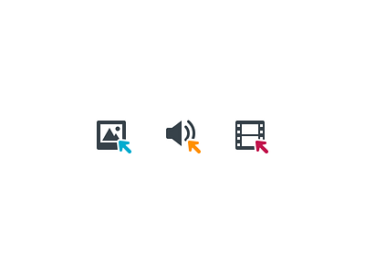
Our big Notabli update for iOS 7 is trucking along nicely. Help us out by throwing in a vote for your favorite icon design.
P.S. I know, I know, blue is everywhere in app icons, but it's our brand color, and we like it. So there.
P.P...