Learn how to choose the perfect logo color scheme for your brand. Get inspired by visual examples of logo color palettes that tell a compelling brand story.
If you think about it, every successful brand has a very intentional logo color scheme that delivers a very specific message and resonates with its intended audience. In this article, you’ll learn how to thoughtfully choose logo color schemes based on your unique brand, and get inspired by incredible visual examples and why they work. Whether you’re using logo templates or designing a branding package from scratch, use this resource to strategically customize your color choices.
How to choose a logo color scheme
When choosing a color combination for logo design, there are a few essential factors to consider. Let’s go over them briefly before sharing some visual inspiration.
![]()
1. Define your brand voice
Before you even start thinking about colors, you need to have a good understanding of your brand voice. Who are your customers? What promise are you making them? What values does your brand uphold? These are all questions you should know the answer to before defining your logo’s color palette.
A good place to start is by picking out the keywords that best describe your brand. If your brand’s keywords are “earthy,” “organic,” and “peaceful,” for example, you’ll probably want to stay away from bold colors like reds and oranges.
Remember, there’s no hard and fast rule that says you have to pick a color palette whose meaning perfectly fits the brand, but you’ll want to avoid picking colors that are antithetical to your brand’s keywords and values.
2. Study your competitors
Next, do a little research to see what colors similar brands are using to convey their message. This will give you a good indication of what works for your industry, but also how you can differentiate yourself from your competitors.
Think about how can you combine certain colors so your logo design stands out from the competition but also stays authentic to your brand.
3. Understand the basics of color-psychology
Try to familiarize yourself with the meanings behind different colors before you settle on the main color scheme for any logo design. Then consider what other values you might want to pull in to find secondary colors.
There are generally-accepted meanings in most of the Western world for the most common colors (or hues). Be aware that different cultures interpret color meanings differently, so you’ll want to research color meanings applicable to your region.
- Red: passion, love, danger, anger
- Orange: joy, energy, warning
- Yellow: happiness, optimism, creativity
- Green: nature, fresh, growth, money
- Blue: loyalty, calm, honesty
- Purple: mystery, royalty, luxury
- Black: mystery, darkness, power, strength
- White: safe, clean, innocent
- Gray: sophistication, elegance, formal, emotionless
- Brown: nature, solid, grounding
Color meanings can shift based on the exact color used and the surrounding colors. To learn more about colors and the emotions they evoke, check out this helpful article.
Now, let’s take a look at some of the best logo color combinations we’ve seen at Dribbble.
1. Firefox
![]()
![]()
In 2019, Mozilla’s Firefox underwent a massive rebrand with the help of Ramotion—a renowned design agency here on Dribbble.
Firefox’s new logo’s color scheme blends both cool and warm colors using a gradient-like effect. The contrasting purple and orange give the logo a bold look and feel that makes the browser super easy to find among your other apps.
2. Figma
![]()
![]()
Figma is a web-based collaborative design software that’s changing the way design teams work. Its logo draws on a bold and vibrant color palette against a dark background that really makes these colors pop.
According to Figma’s brand guidelines, their brand “colors are rooted in design history—drawing inspiration from modernist such as Paul Rand, and the vibrant color schemes of the Modern era.”
3. Better
![]()
![]()
Better is an app that helps freelancers manage their income and taxes. While financial products traditionally use colors like green and blue to evoke trust and growth, Better has incorporated a bright yellow that speaks more to the creative aspect of their business.
Finances don’t have to be boring, and as a fin-tech app, Better has done a great job of communicating that message through their brand color palette.
4. Duolingo
![]()
![]()
The popular language-learning app Duolingo went with a “Feather Green” inspired by their bird mascot to represent their brand. As an educational app, using this bright green hue does a great job of evoking growth and new learnings.
5. Incfile
![]()
![]()
Incfile is a service that helps people set up their LLCs. The design team at Balkan Brothers recently proposed a new logo and distinctive brand color palette to reflect a user-friendly, modern technology company.
Combining these unique colors together in a logo really differentiates Incfile from other competitors on the market and works to create an instantly recognizable brand aesthetic.
6. Collibra
![]()
![]()
As a data intelligence company, Collibra’s logo colors are extremely approachable. Its deep blue and bright green bounce off each other creating a friendly, yet sophisticated color story. Mixing these two colors together elicits trust, and helpfulness.
7. Asana
![]()
![]()
Asana’s distinctive color palette blends together the warmest colors on the color wheel in a beautiful gradient.
As a task management tool to help teams get organized, Asana’s logo color palette is lively, energetic, and creative—the feeling users will hopefully have when using this tool.
8. Zendesk
![]()
![]()
Zendesk is a customer service software. Their main brand color is called “Kale” and it’s a deep blue-green hue that creates a nice contrast against white, which is also a primary color in their logo design.
As a tool to communicate and support customers, Zendesk’s logo color scheme sends a powerful message of trust, clarity, and humility when it comes to their brand.
9. Nutshell
![]()
![]()
Nutshell is a powerful CRM and sales automation platform that just got a new logo thanks to the folks at FocusLab.
The logo color palette consists of blue and orange which are on opposite sides of the color wheel, making them complementary. The contrast against the bright orange and deep blue creates a beautiful dual message that screams energy and stability.
10. PicnicHealth
![]()
![]()
PicnicHealth is a startup that gives patients a way to manage their healthcare in one place and lets pharmaceutical companies access patient records for real-world data. The startup just underwent a rebrand led by the design team at Unfold.
Unlike traditional healthcare companies, PicnicHealth’s unexpected color palette is bold, vibrant, and uses multiple colors for a dynamic brand aesthetic. It screams modern, and not your average healthcare brand.
11. Recital
![]()
![]()
Recital is a service that aims to simplify workflows for busy in-house contract negotiators. According InputLogic who designed this logo, Recital wanted a logo that was both professional and approachable.
They focused on bringing colors that carried feelings of trust, warmth, and friendliness. The small pop of yellow on the wordmark really helps achieve that feeling of warmth.
12. Oculus
![]()
![]()
Believe it or not, black and white are both powerful colors that shouldn’t be overlooked in your logo color palette selection.
The Oculus brand which is known for producing high-tech virtual headsets is a perfect example of this. This simple, yet effective logo color scheme incorporates both white and black together to create a high-end, straight-forward, and clean brand aesthetic that also works as a reflection of their products.
13. MOON
![]()
![]()
When it comes to skincare products, brands typically like to stick to a more organic, neutral color palette that emulates natural, healthy ingredients.
With MOON skincare, the design team at The Faces tried something completely different—and it works. The logo’s color palette incorporates pink and purple hues that are reminiscent of space, but also hints at a luxury product that gets people excited about the brand.
14. Pinpoint
![]()
![]()
15. Mailchimp
![]()
![]()
Mailchimp is a marketing and email automation tool that has always been known for their extremely recognizable brand color scheme of yellow and black.
The yellow goes hand in hand with their monkey mascot, but also evokes feelings of creativity and joy. The black on the other hand, helps instill a feeling of power and strength. These dualities do a great job of communicating a powerful yet friendly approach to marketing.
16. Apprentice Health
![]()
![]()
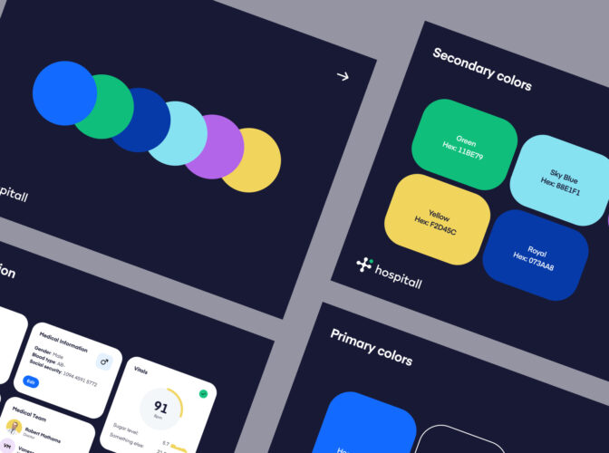
As a healthcare company, Apprentice Health went with a more traditional color palette with a twist. Blues and greens are common when it comes to healthcare branding, but in this case, the blue and green are brighter than usual, sharing a similar hue. This modern take on a classic healthcare logo color palette really differentiates them as a brand.
17. Stripe
![]()
![]()
The popular payment processing software Stripe has become a forced to be reckoned with when it comes to their bold branding choices. Going against the grain of your typical fin-tech company, Stripe’s bright purple hue is unapologetically innovative, modern, and fearless. The message they are sending is one that positions them as a fin-tech brand of the future.
18. Bestow
![]()
![]()
Bestow is a life insurance company with quite a unique logo color palette. The team at Brass Hands helped Bestow rebrand back in 2018 when their brand color scheme was made up of a medium blue and bright white.
Bestow’s new logo now appears more friendly and inviting thanks to the warm orange and bright turquoise, while still maintaining a sense of trust and honesty as a life insurance company thanks to the deep green.
19. Kaff
![]()
![]()
Designer Salih Küçükağa has been exploring some pretty unique brand concepts for Kaff, a cold brew coffee brand based out of California.
In this brand exploration, Salih went with red and blue color palette creating a nice contrast and a bold brand aesthetic. When it comes to coffee branding, red and blue together is quite unusual, but in this case, the color combination works to differentiate Kaff as a modern, innovative coffee brand.
20. Dribbble
![]()
![]()
Of course, we had to throw in Dribbble’s own logo into the mix! Dribbble’s iconic pink color palette is one of the most recognizable elements of our brand. As a creative community, our pink works well to communicate playfulness, creativity, and joy.
21. Slack
![]()
![]()
Slack is a communication tool that many remote teams use to stay connected Their multi-colored logo is filled with bright colors that work to stand against the deep purple background of its main interface. It’s fun, inviting, and exciting—the feeling that comes with connecting with people from all over the world.
22. Odds On VC
![]()
![]()
As a student-run venture fund, Odds On VC champions a playful, vibrant, and optimistic color palette—certainly not a color scheme your average VC firm will have. Overall, the brand’s personality is reflected through these lively and unexpected colors as a way to attract their ideal customer.
23. StarBank
![]()
![]()
Who ever said banking has to be boring? StarBank’s bright green and purple logo color palette against a dark navy blue creates a striking, unique look and feel that’s unexpected, fun, and experimental.
The colors work beautifully layered against one other and even in a gradient application. This is clearly a non-traditional banking brand catered to a modern, open-minded audience.
24. Roselab
![]()
![]()
25. Barn Media
![]()
![]()
How fun is this logo design concept for a recording studio? A muted orange, blue, and yellow achieve an imaginative and fun look and feel that attracts a creative audience.
Find more logo color palette inspiration
Remember that coming up with some of the best logo colors can’t be rushed. It’s unrealistic to come up with a winning color palette on your first try. Even with years of experience, most designers spend days or even weeks finalizing color palettes for their designs. Color’s impact cannot be understated, so spending time on this portion of the design will pay off in the end product.


