Done & done!
Worked on a variety of minor tweaks to help finesse the readability issues...and at this point I'm pretty pleased with it how it all comes together.
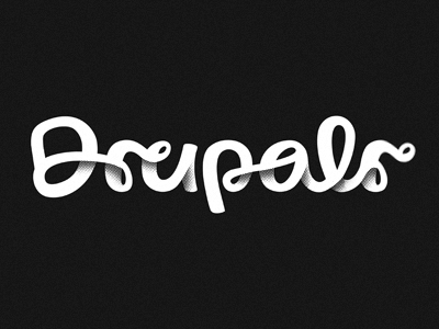
Ultimately we decided to run with a simpler shading style in order to...
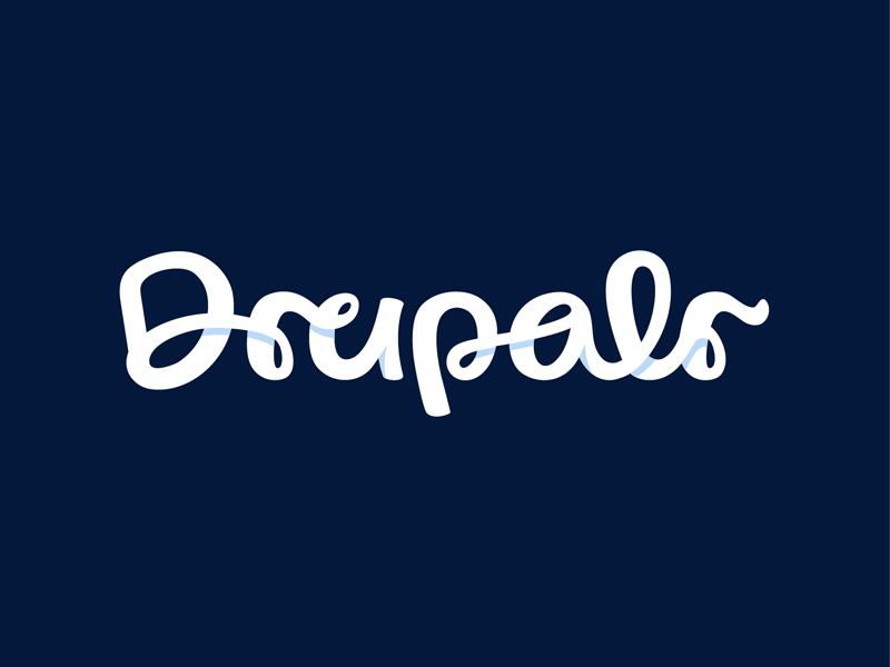
Taking some time with the scripted version tonight > working on nailing down some better readability...
Redrew the entire letter set, and worked out a closed 'D' that hopefully gets rid of all the 'H' confusion.
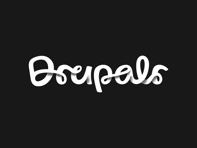
**Full version attac...
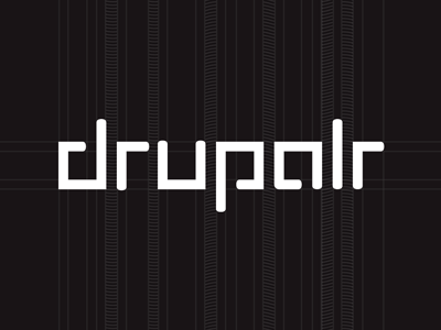
More logotype exploration... Still got my grid, but it's not quite as obvious. L/R probably need a spacing tweak, but I'm liking the stye on this one...
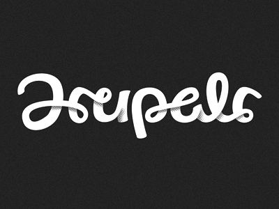
Brought back the halftone, just for kicks...
Working on a secondary logotype option for this guy at the polar end of the style spectrum.
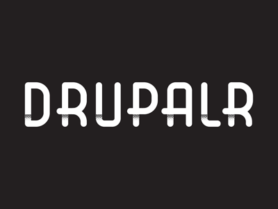
Wanted to mesh out something clear & constructed while I work on wrapping my head around those crazy curves...
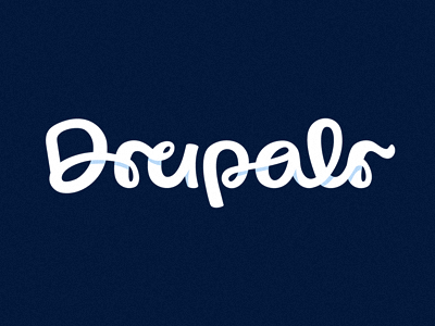
Further exploration into the scripted logotype option...
Again > small spelling tweak, so I had to nix the PL/AR ligature pair, which I was pretty fond of...
In any case, lots more tweaking to do on this one, but at least we've got ...
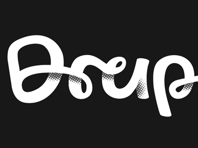
Small crop of a script logotype exploration.
Playing around with some rough shading scenarios just to get my head around it.
Scanned in the sketch this afternoon > so it's very much an early work in progress...