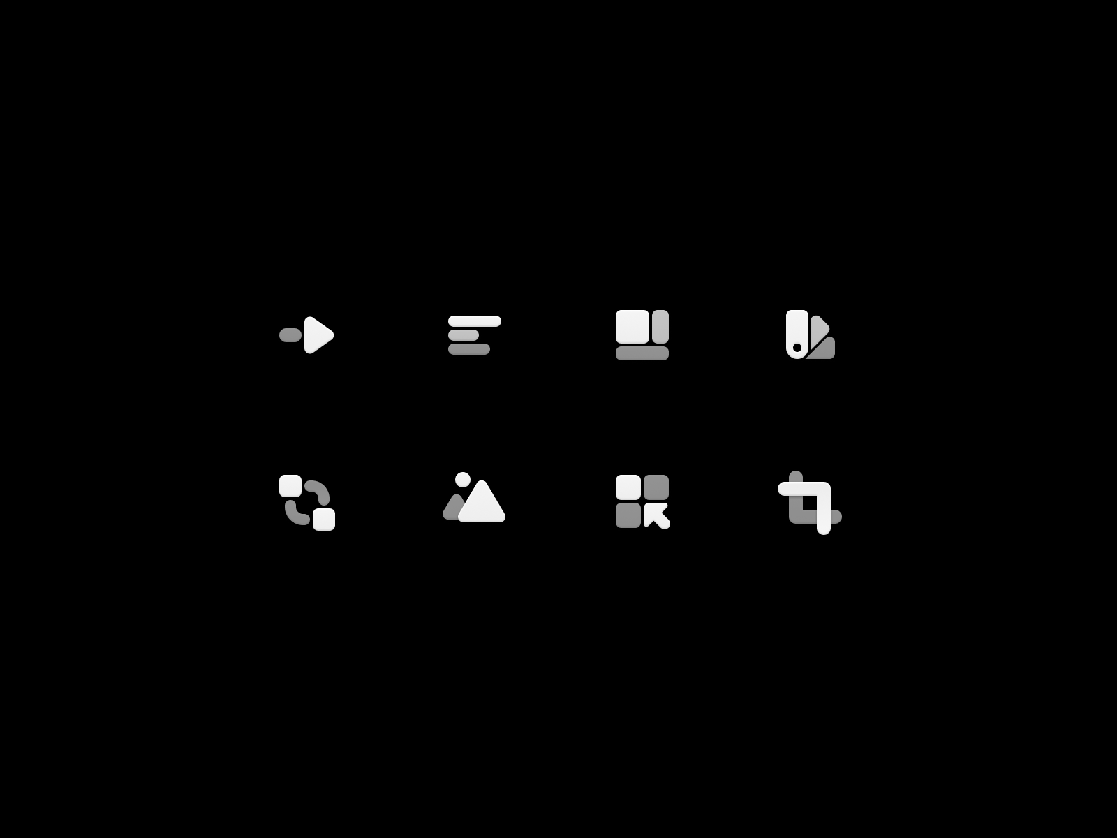
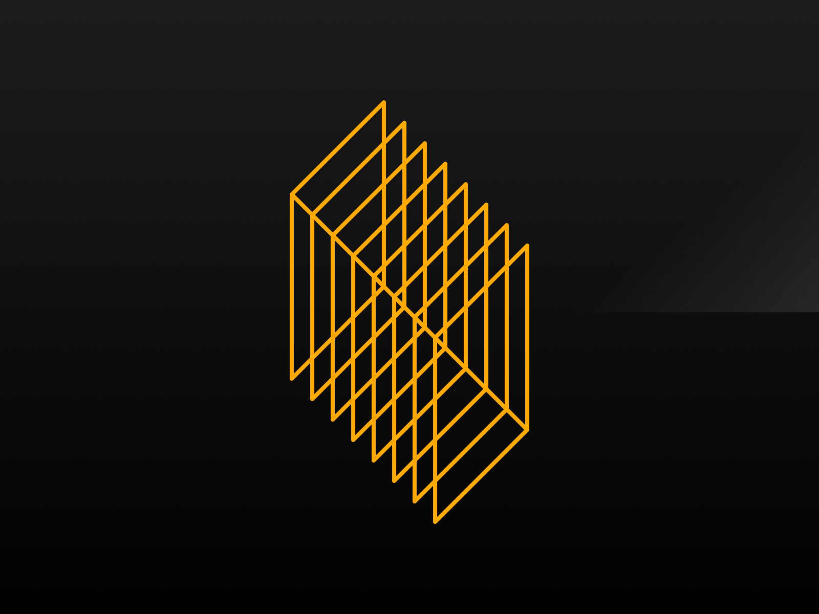
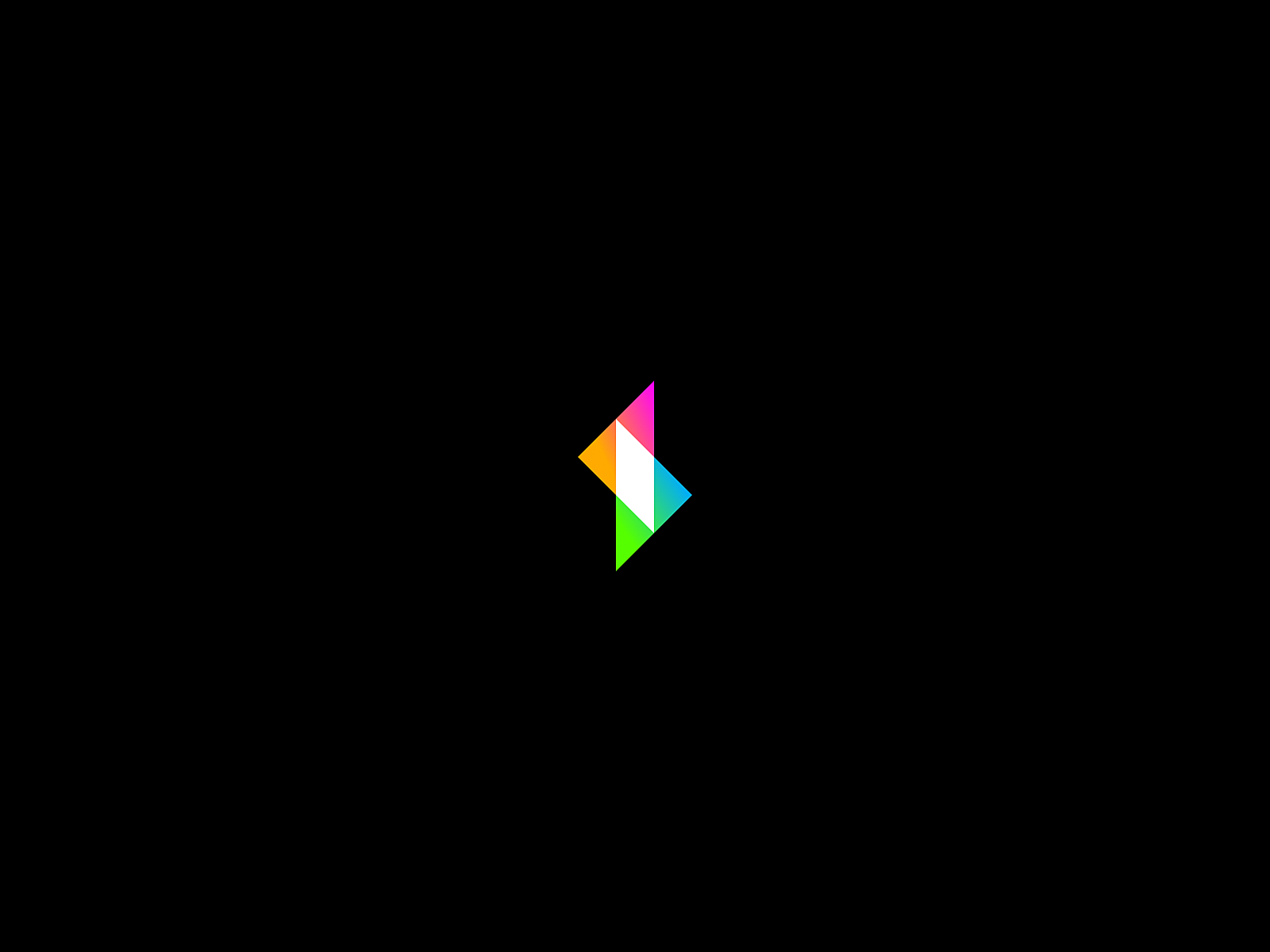
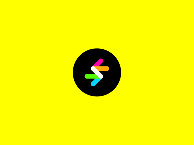
Ok, one more little tweak to this guy. rearranged the colors slightly and decided to go with sharp corners instead of rounded so it's all constructed out of the same shape. This lends itself to fun animation possibilities. You're watchin...
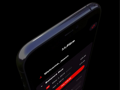
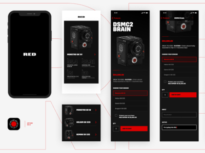
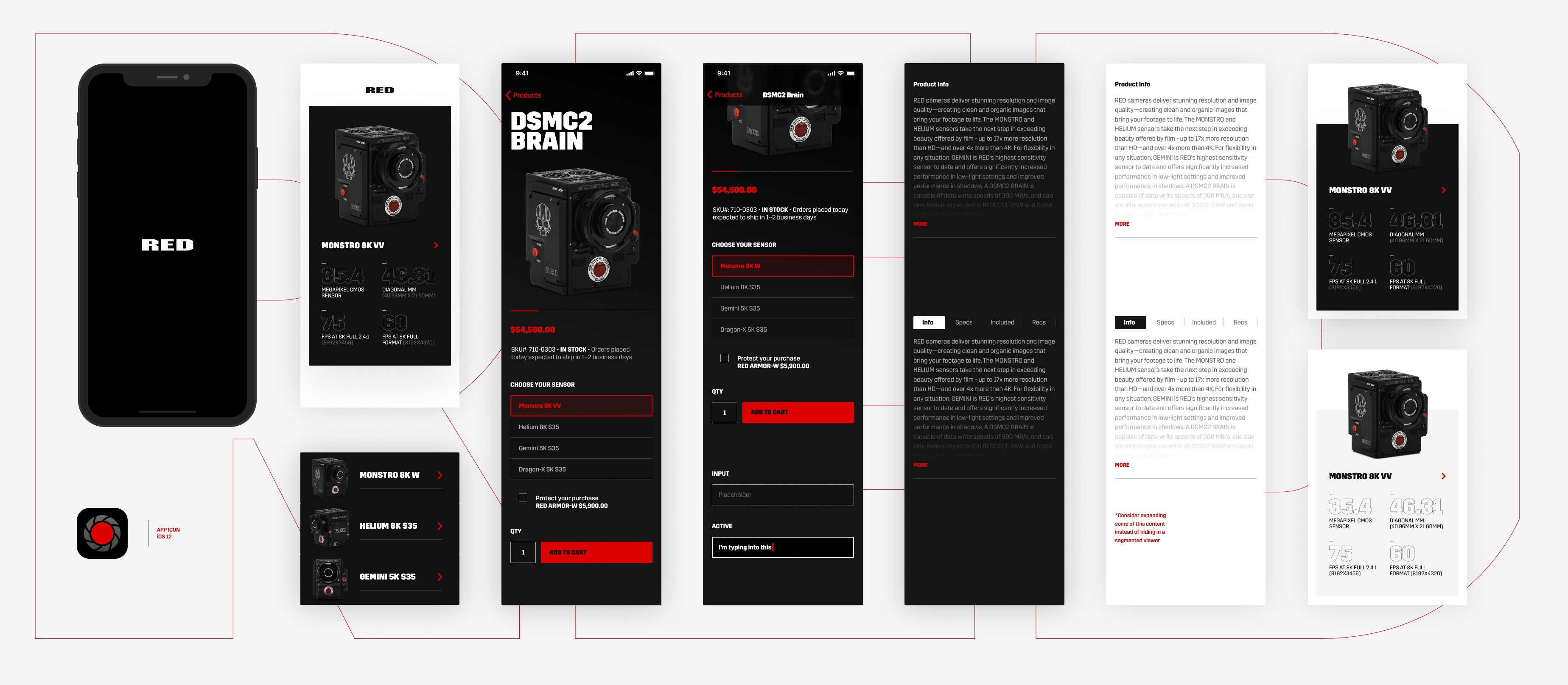
Designed this iOS concept for RED cameras. See attached for larger/full version.
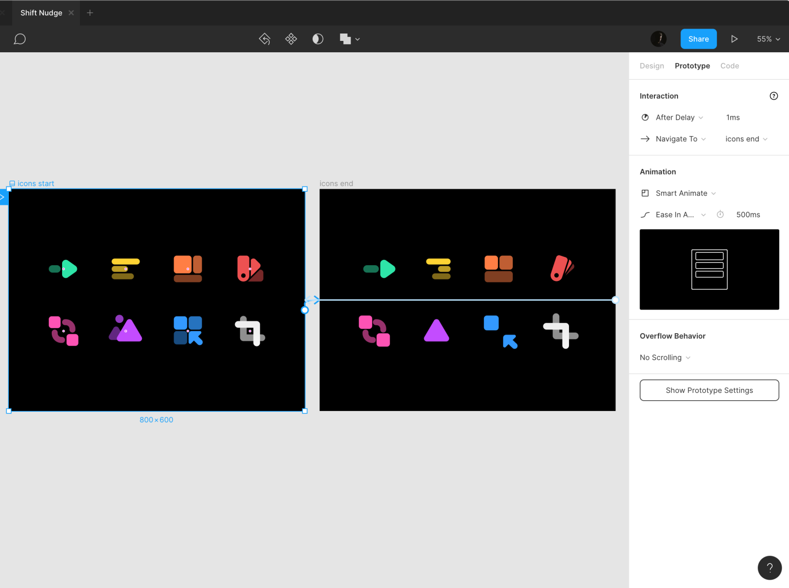
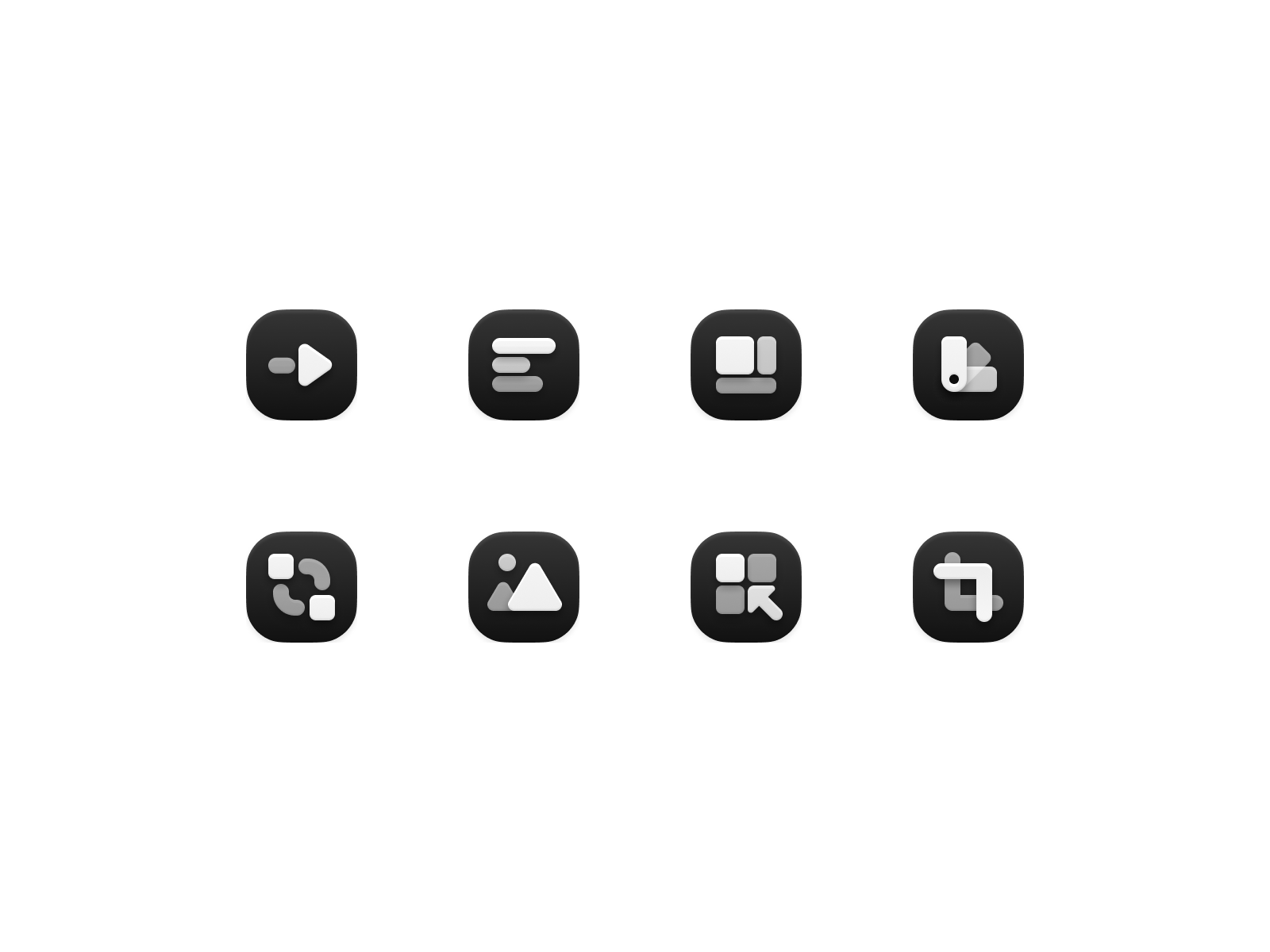
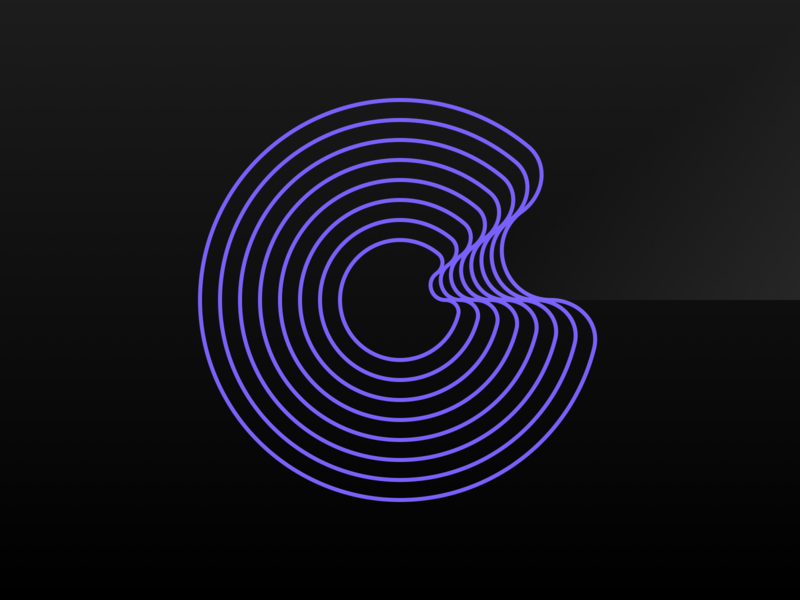
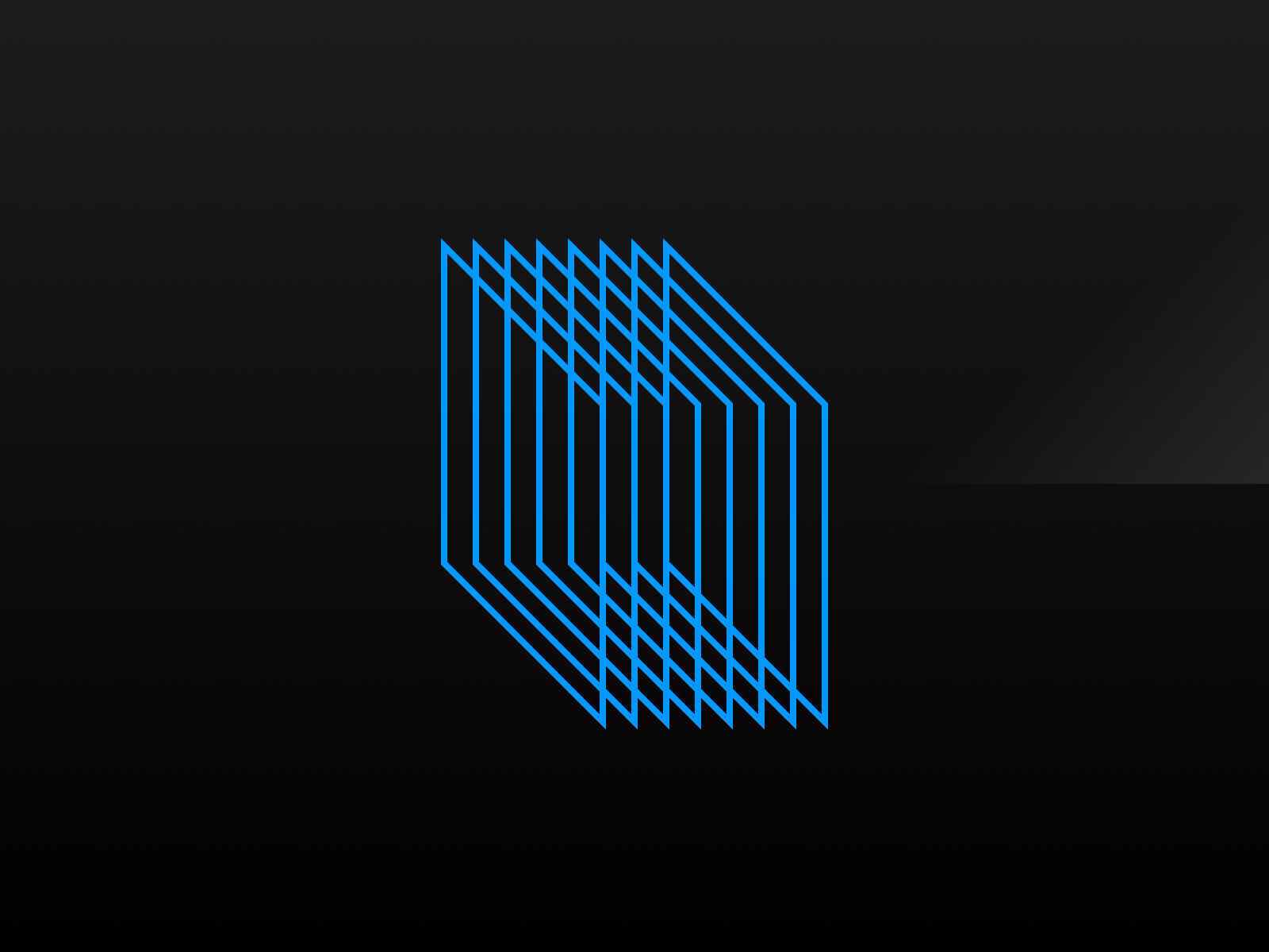
I wanted a fun project to design while I recorded a Shift Nudge lesson for one of my element-collage-design-experiment videos.
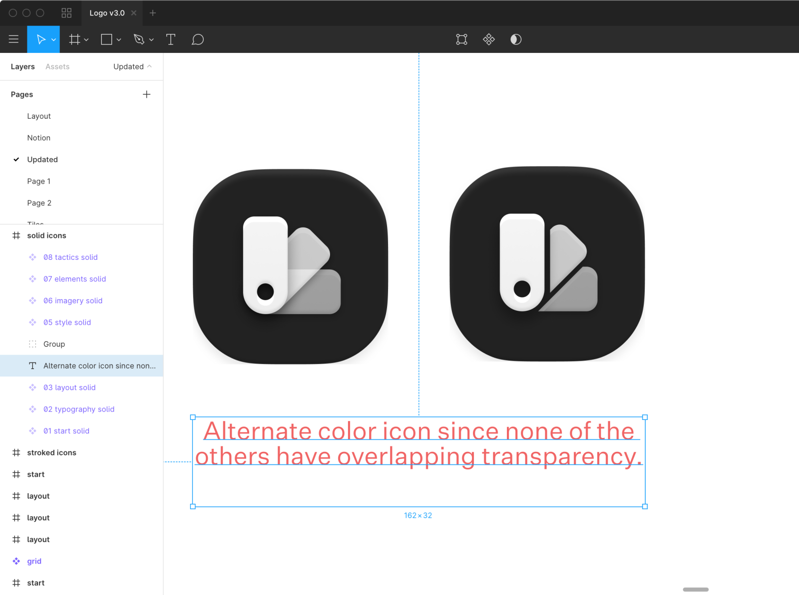
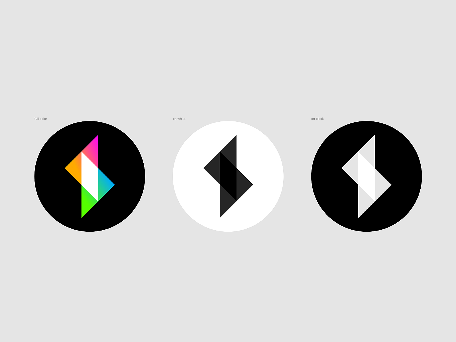
Decided on no opacity in the logo. Solid shapes only. Something about this strong yellow/black contrast that I really love too.
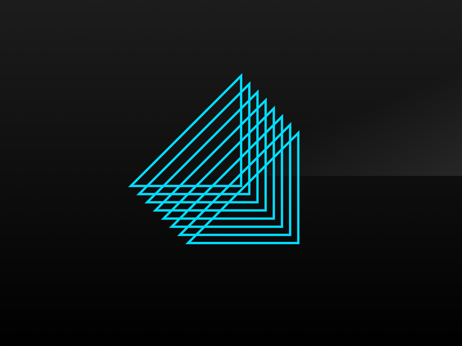
Gonna stop the branding efforts here for now. Thanks for your input on the last few logo shots!
If you're ...