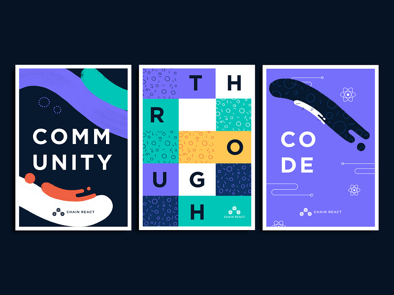
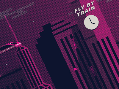
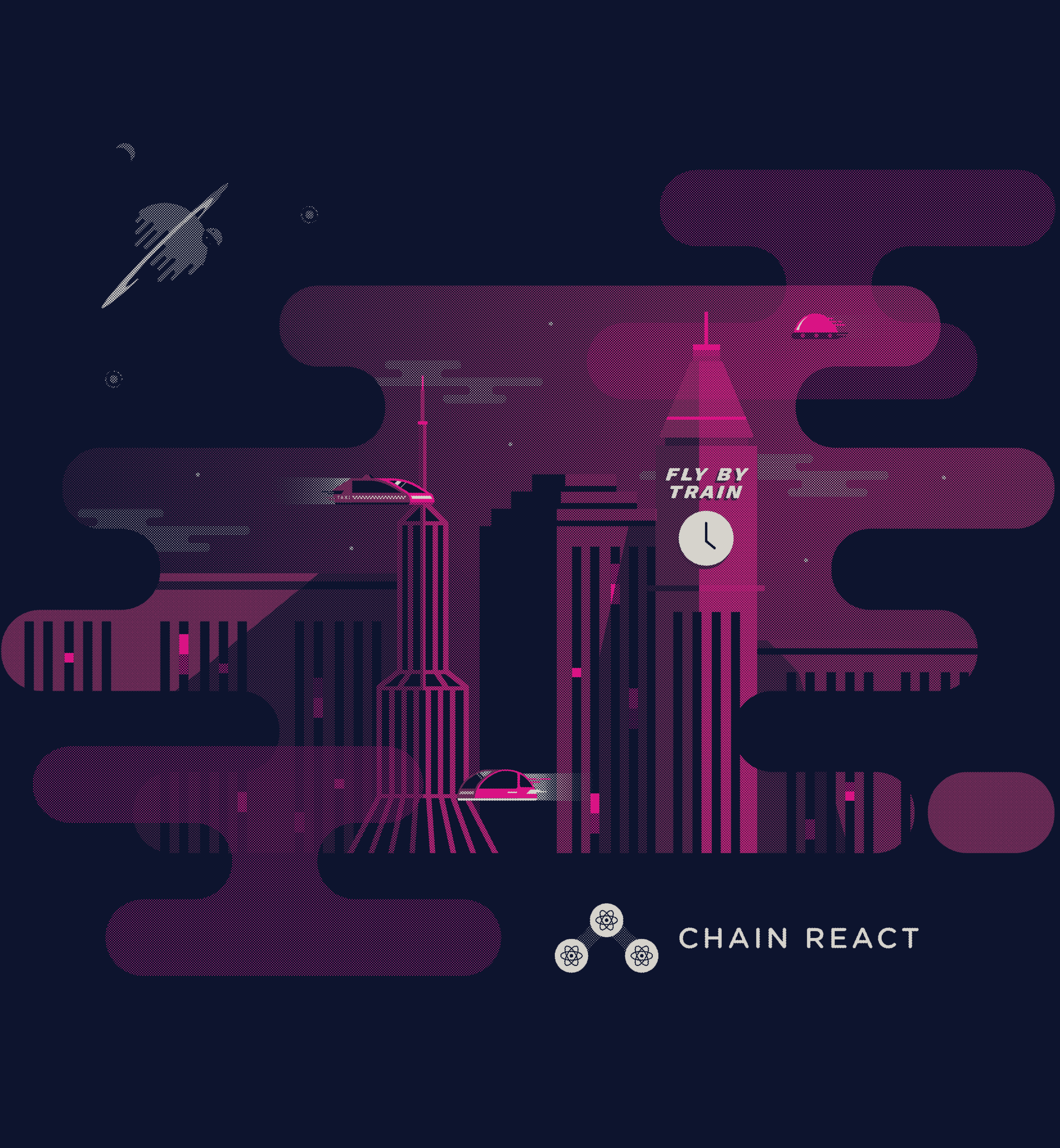
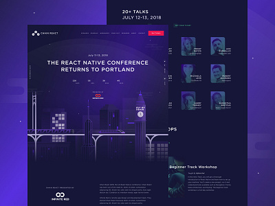
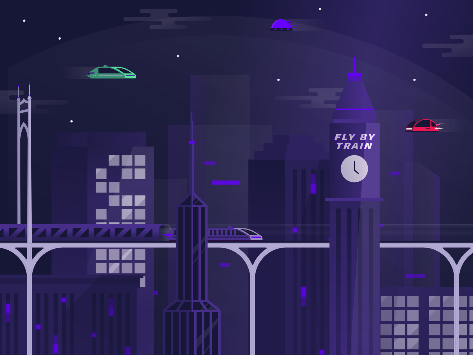
Playing with the different shapes and colors to create some movement. We've gone through quite a few iterations for this landing page design.
Check out the live site
Alternate version of the slider with different colors and illustration pieces to separate the list of speakers and workshops.
This was a fun exploration for the slider setup, but didn't make the cut for the full site. We recently launc...
A couple quick explorations for some poster concepts.
This direction explored the idea of of a mural-like style by piecing together brand illustrations and patterns to create different layouts that could work together.
Playing around with some colors and layouts for a speaker list.
Lots of fun lil elements to experiment with for a conference brand. More coming soon!! ✌️
I love working with halftones. Haven't worked on anything like this in years so it's super fun to get back into it. If I had the space there's no doubt i'd have a screen printing setup and just do this all day.
This was the original de...
Our team has been hard at work over the last few months prepping, designing, and getting things in gear for this year's conference. We've got a bunch of fun things to show over the coming months.
Here's a quick look at the website we p...
Caffeine at a conference is a must! Thank you to Qlik Playground for sponsoring our coffee!
We're only 37 days out! If you haven't gotten your ticket yet, get one here before we sell out!