In this animation by @Karlo Stipic we are presenting mobile version of application. During the creation of the mobile version, we had to pay special attention to the hierarchy of the information and to create prioritization of the cards ...
Today we present a mobile version of the dashboard for the Vent application. When creating the mobile version, the 12 column grid used on the desktop version helped us, so the adaptation was easy. We took special care of the hierarchy of...
Hi guys! This animation shows a quick and easy way to sign up for a whitelist in just a few steps. The challenge was to make this flow as simple and compact as possible while making everything clear to the user and at hand. Check the cas...
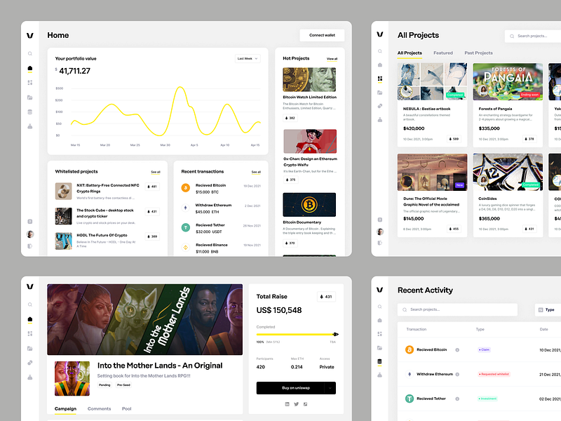
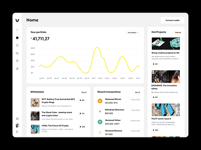
Hi guys! In this post, we present the Vent application and some of the main screens of the application - Dashboard, Project profile page, All projects page, Recent Transactions. They all have in common that it was necessary to make a str...
Hello everyone! In this post, we present you the Dashboard. While designing the Dashboard, it was necessary to invest a lot of time thinking about user needs, what they want to see, and where they want to go as soon as they enter the app...
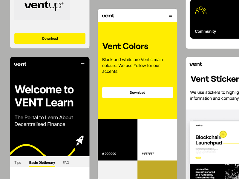
Hello everyone! The Vent is simple, easy, and playful. The brand's point is to be fun to use, but at the same time to be crystal clear to everyone who visits the site or the application, how, where, and when. The brand is enriched with f...
Hi guys! Here is the mobile version of Vent's website. You may see some other pages of Vent's site. Some of them are pages for investors, project creators, the About us page, the News page and brand assets where we present who Vent is. C...
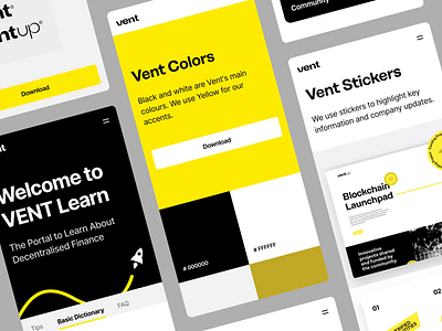
Hi guys! Here is the animation of the mobile version of Vent's website. You may see some other pages of Vent's site. Some of them are pages for investors, project creators, the About us page, and brand assets where we present who Vent is...