Here is a preview of a larger component built with the Blueprint UI toolkit at Palantir.
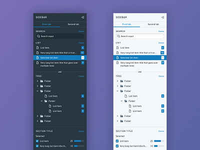
This collapsible sidebar template contains composable components that come with the Blueprint library. These more complex, molecular UI pieces hel...
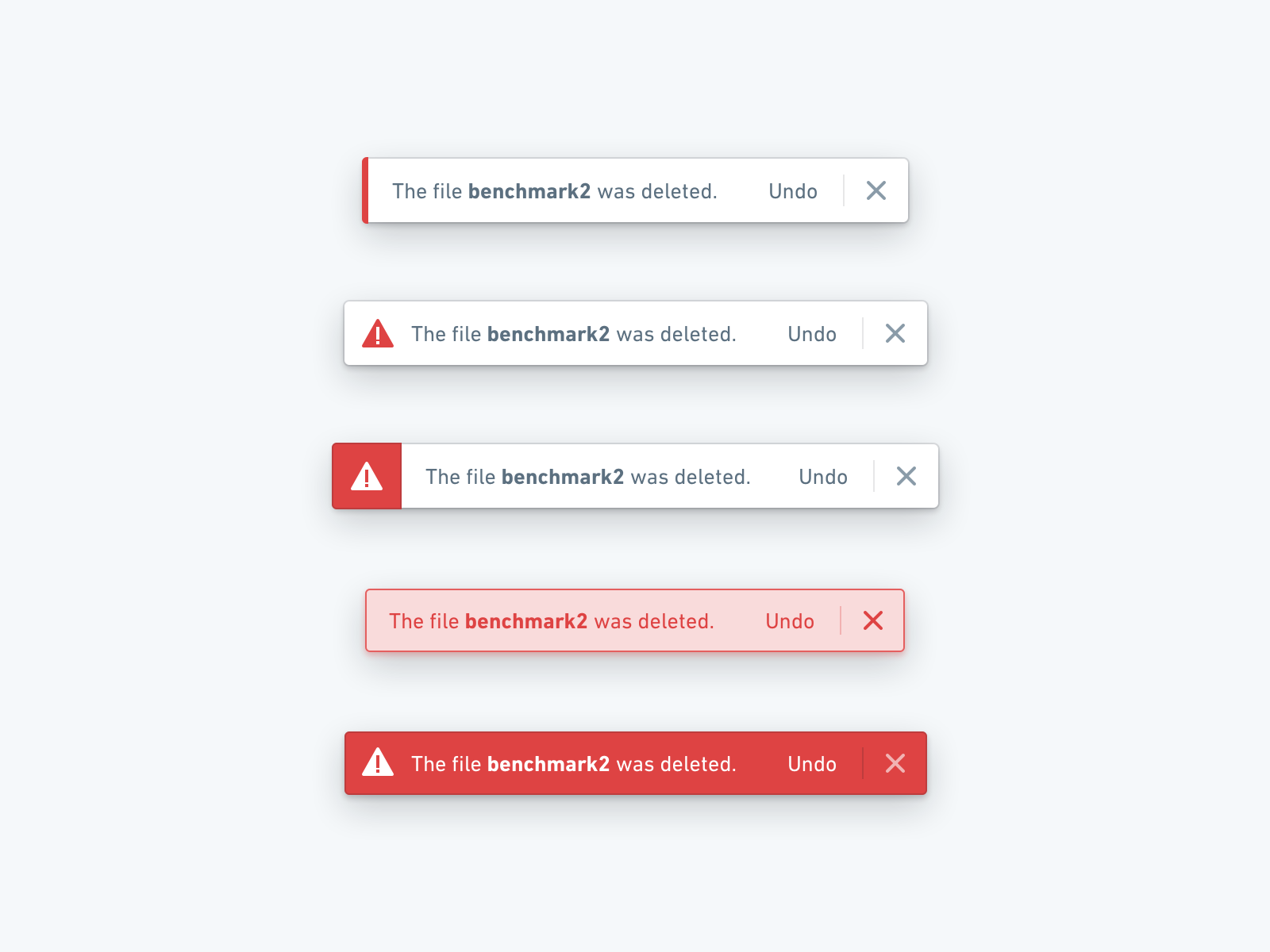
Visual iterations of Blueprint’s toast messaging system.
In order to maximize accessibility, we went with the last option: we rely on both strong contrast and iconography to convey the intent of the message. We also use motion to draw ...
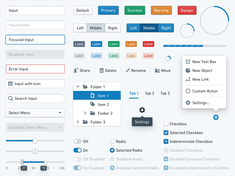
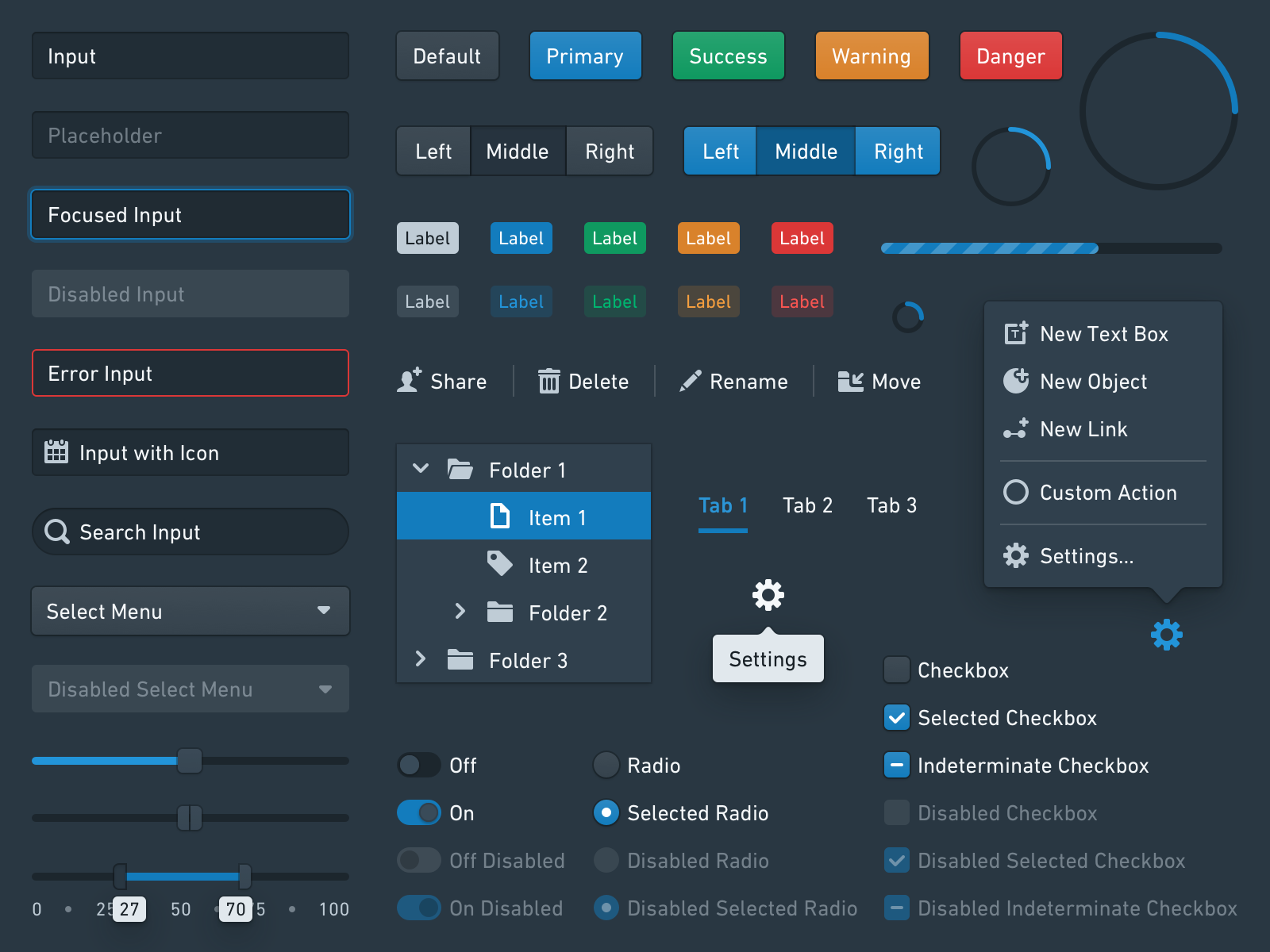
Blueprint is a newly open-sourced design system implemented as a collection of compassable React components and optimized for desktop applications.
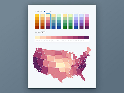
As part of the documentation, we’ve built color scheme generators to produce sets of co...
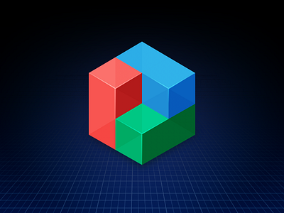
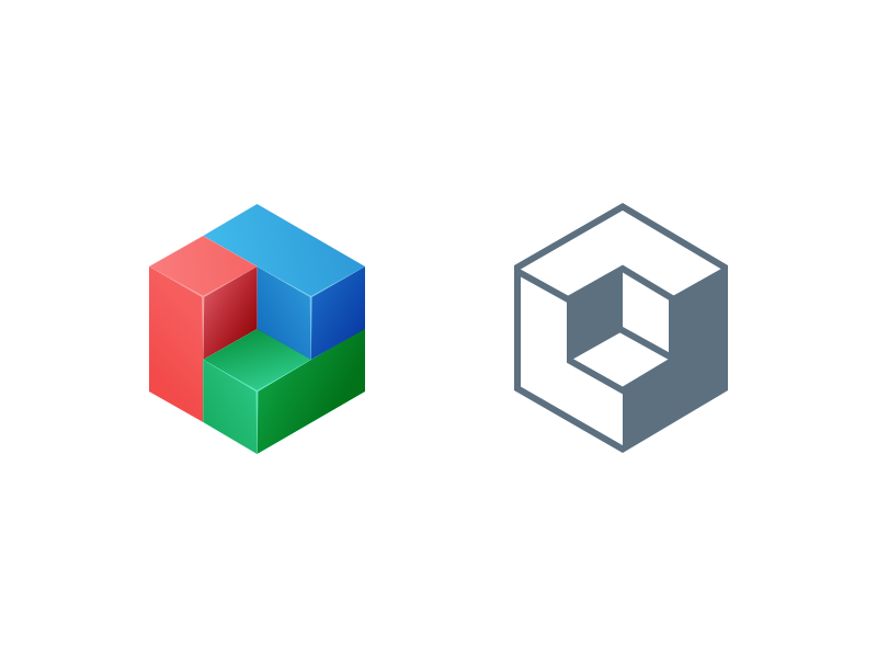
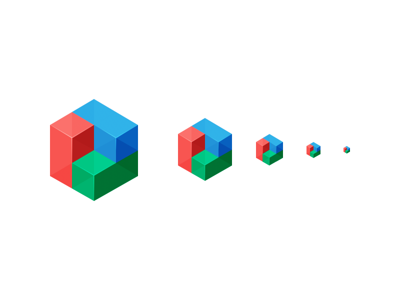
Logo for Blueprint, an open-source UI toolkit for the Web. It’s one of the pieces of our design system here at Palantir. Check out the exploration work attached, including different styles, colors and sizes.
View the full documentation...
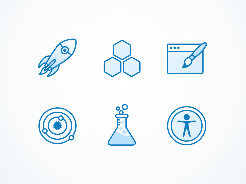
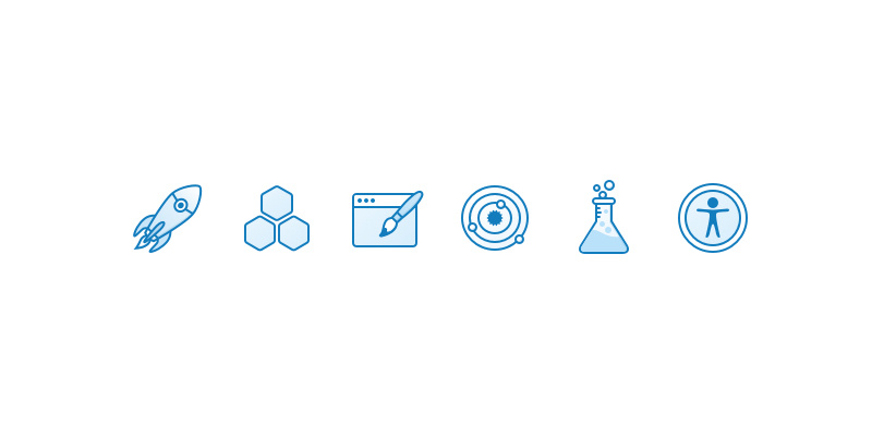
A set of feature icons for an upcoming open source project we are working on.
From L to R: productivity, composition, custom styles, design system, types and tests, accessibility.

 blueprintjs.com


