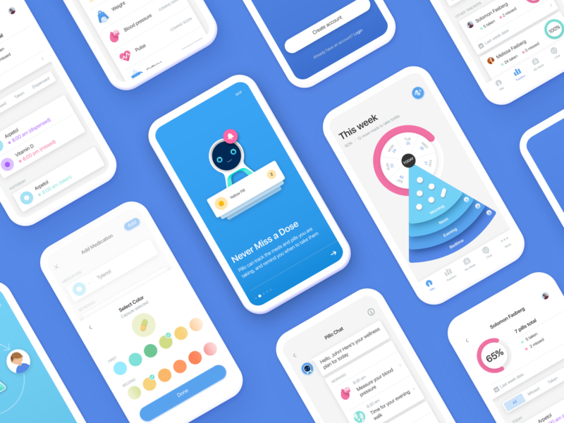
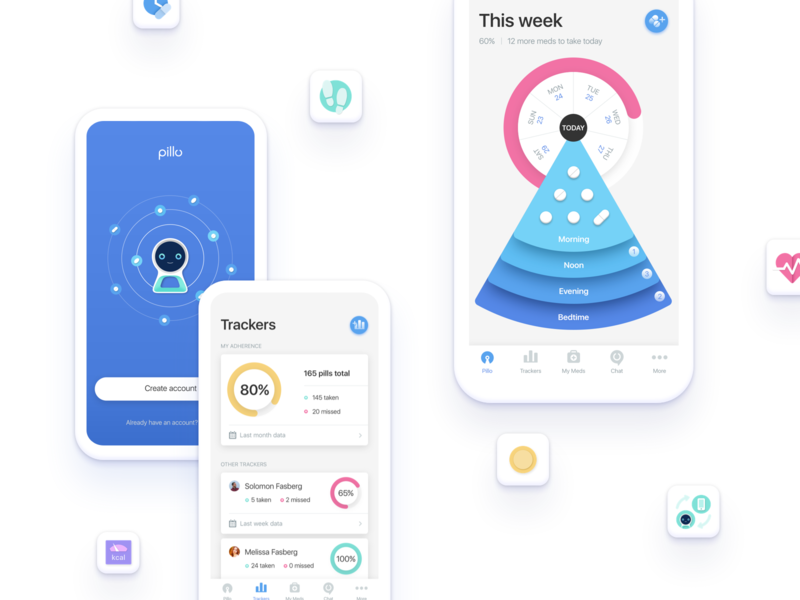
Check out these screens of Pillo Health Application: the interface is very multifunctional, so it was important for us to make the screens look connected, but each carrying its unique sense and appearance. Harmony is crucial, especially ...
Here's another shot of our work for Pillo, a personal healthcare assistant. As you can see, we've chosen blue as a dominant color as some psychological research show it induces trust and confidence and also we created icons fun and brigh...
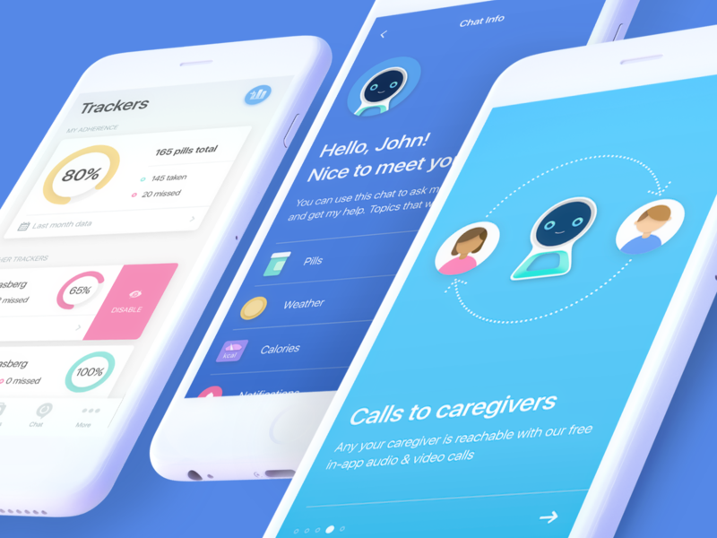
Either it’s the audience who induces new requirements or it is the introduction of new functionality, we do our best to improve and adjust the product to the current necessities. 💊💊💊 See our updated design for Pillo healthcare applicatio...
Creating a nice-looking and comprehensible interface is only half the battle — the other important thing is to keep it relevant. We strive to improve projects and make them go in step with the times, just like we did in Pillo healthcare ...
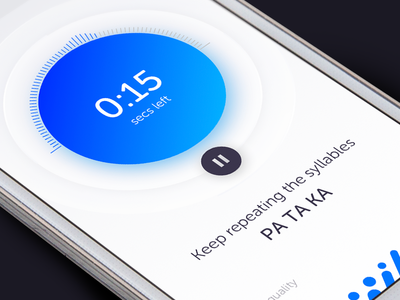
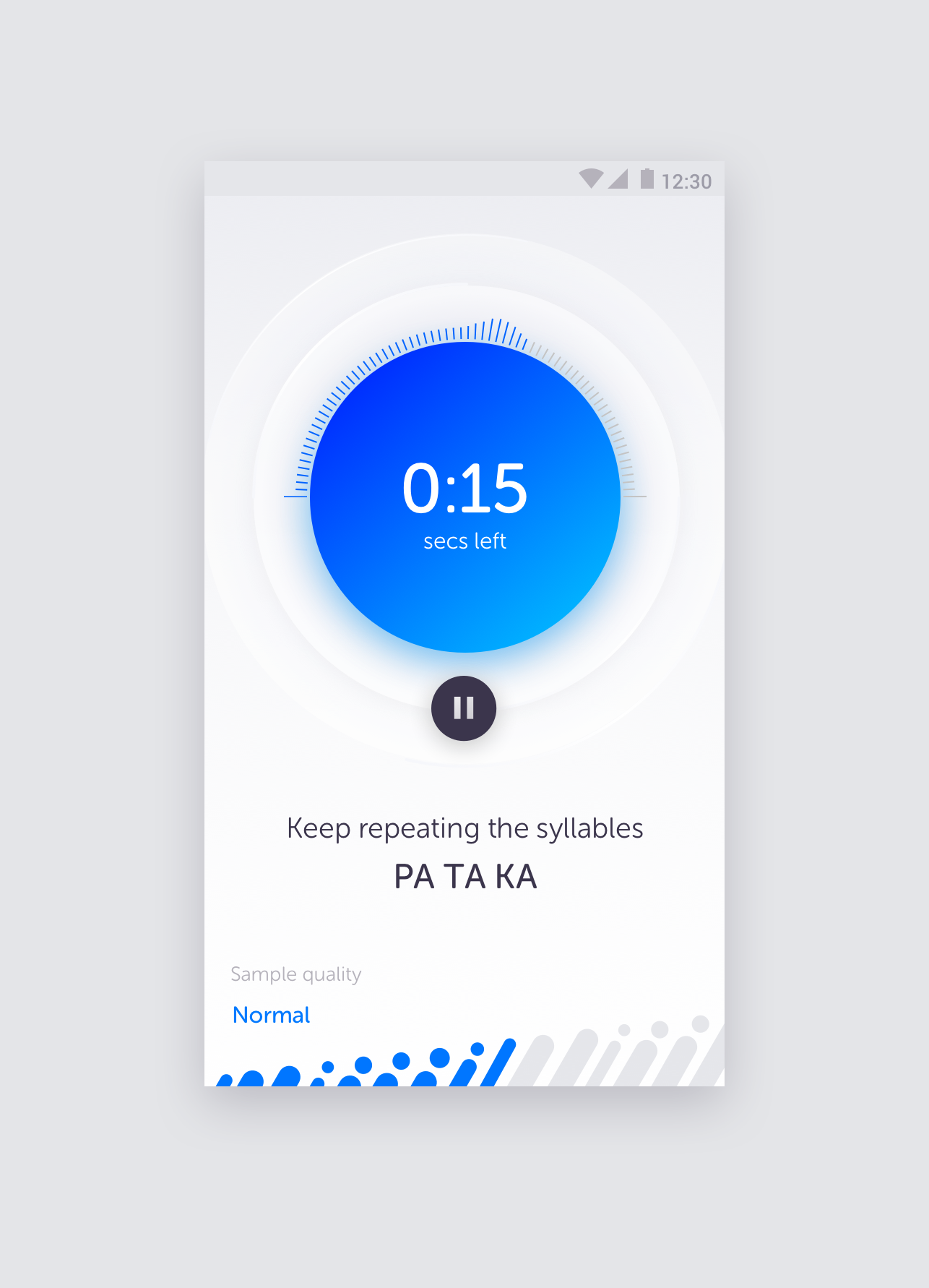
Shhh... Voice capturing screen. Sound in water and sound in air are both waves that move similarly and can be characterized the same way. We made the design look fresh and add the vibes similar to sound waves and UI controls hovering ove...
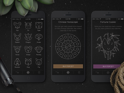
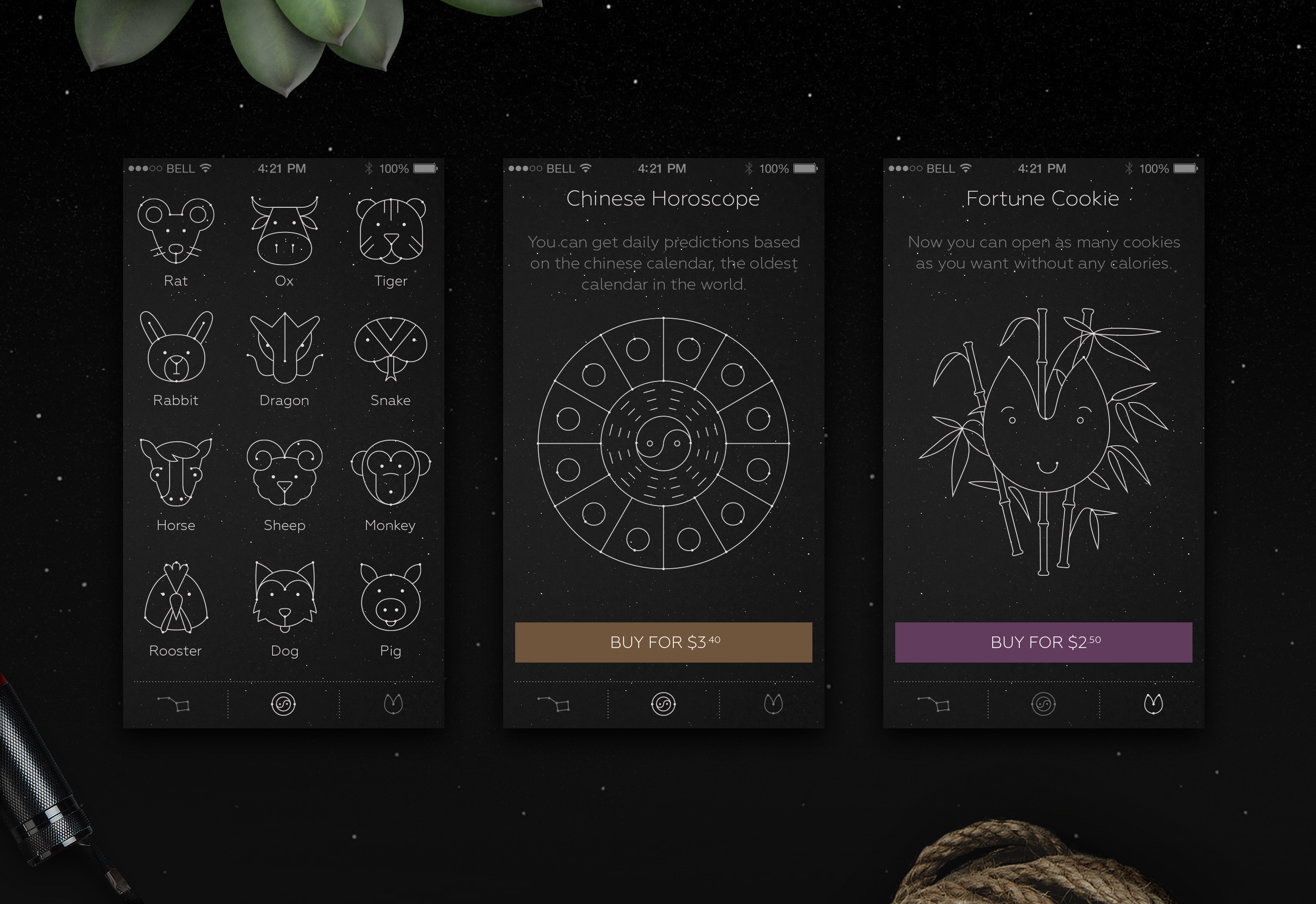
Hey guys! Here is another part of the horoscope app — Chinese section. People can get daily predictions based on the Chinese calendar (the oldest calendar in the world btw) and make some fun of fortune cookies which is our favorite part ...
Do you want to get the prediction? Click the icon and follow the mysterious vibe… ⭐⭐⭐ We created icons with stellar look and tried to make them light and positive. Check the full showcase of Luna app on our Behance
Press “L” on a keyboa...
Our new collaboration with a Y Combinator startup Wheelys café turned out to be a great adventure to create the best ux / ui for coffee on the go!
Press “L” on a keyboard to share some love and follow us if you don’t want to miss our up...