Find designers
Designer search
Quickly find your next designer
Post a job
The #1 job board for design talent
Inspiration
Courses
UX Diploma
Learn UX design from scratch in 6 months
UI Certificate
12-week UI skill building for designers
Live interactive workshops
with design professionals
Jobs
Go Pro
Log in
Dribbble: the community for graphic design
Weekly Warm-Up is BACK! 🎞
Rebound your shot by June 9th to participate
Log in
Sign up
Design System
Facebook icon
Share
Twitter icon
Tweet
Copy
5 Shots
•
5 Designers
sajjad ahmad
Facebook icon
Share
Twitter icon
Tweet
Copy
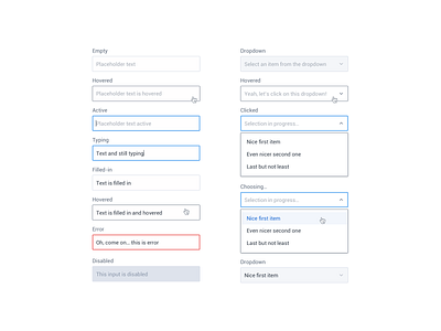
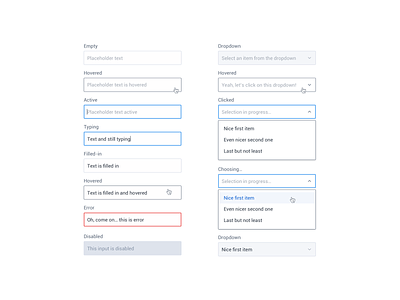
View Inputs & Dropdowns (Countly)
Inputs & Dropdowns (Countly)
Like
Antonin Kus
Pro
Like
183
167k
Shot Link
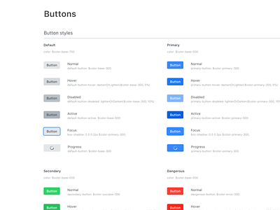
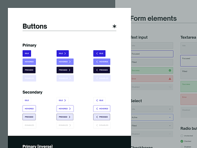
View Buttons - Design System Guide Lines
Buttons - Design System Guide Lines
Like
Paolo Sabatella
Pro
Like
127
46.5k
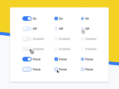
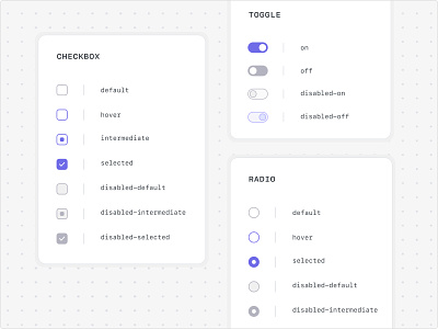
View 🖥️ Switch / Checkbox / Radio button
🖥️ Switch / Checkbox / Radio button
Like
.turnaround
Like
131
98.5k
View Design System
Design System
Like
Cycode Design Team
Team
Like
50
14.4k
Shot Link
View Multiply - Style guide
Multiply - Style guide
Like
Ensage
Team
Like
185
130k
Sign up to continue
Loading more…
Previous
Next
Loading…


