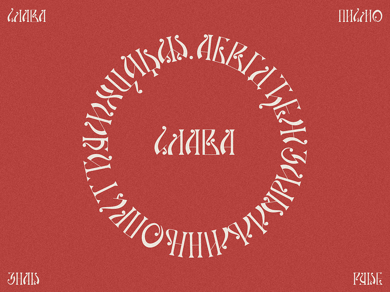
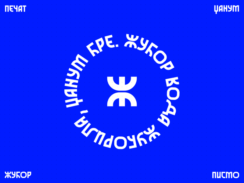
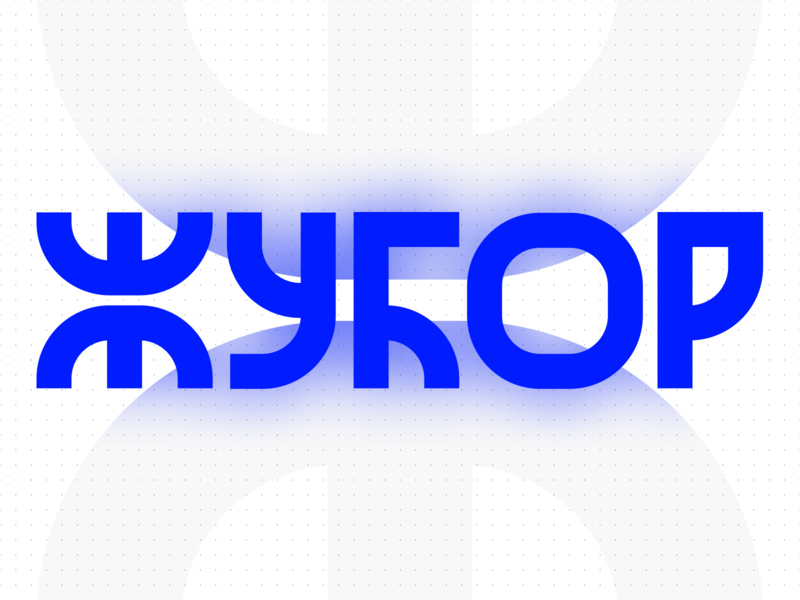
I like circular typographic elements, they give me a vibe of an office seal and that is an another element that pulls towards that traditional or retro vibe. All though this seal is fairly modern and I love it for being such!Check out th...
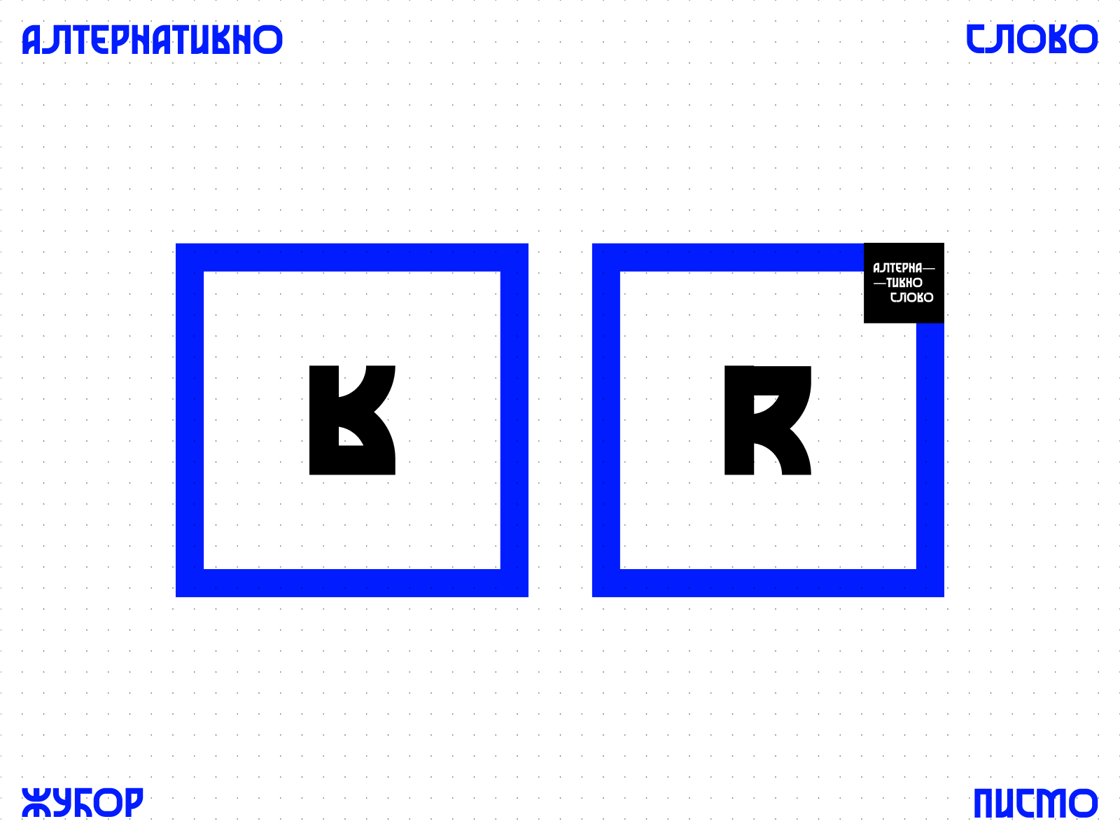
When laying out the whole font and the characterset, I've added an alernate mark that felt really cute as an element and I wanted to isolate and showcase it a bit.Check out the full Behance project as well.
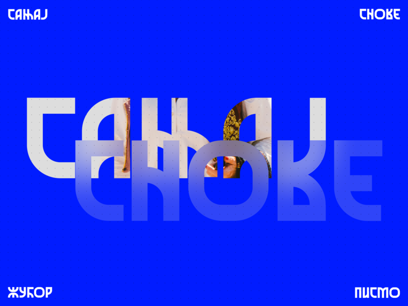
Addition of traditional elements though photography has proved to work like a Vlach charm here. Very happy with the end result of the project.Check out the full Behance project as well.
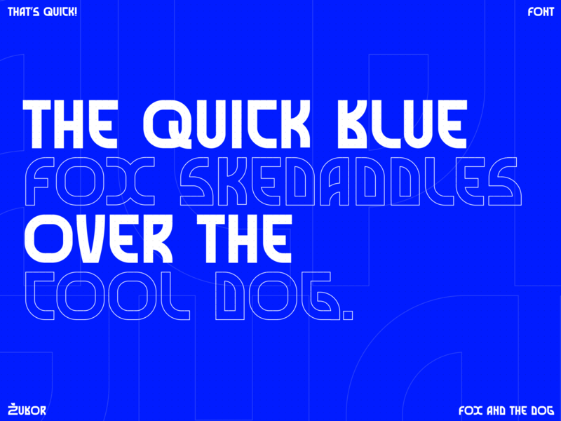
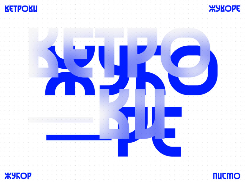
Example of type application — I wanted to develop a color and a graphic element for this font that can be fully set as a branding system. Dots, dual-tone color application and glassy graphics gave me all that I wanted out of this project...
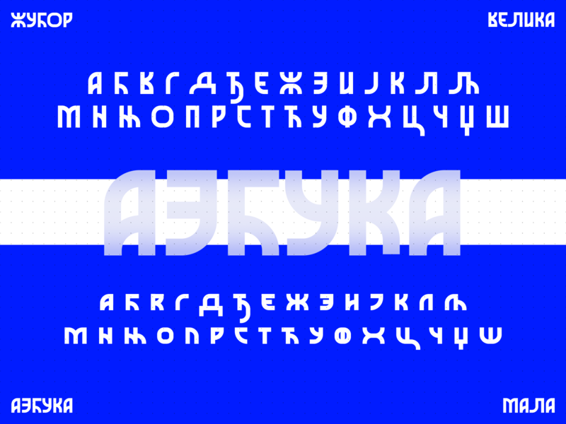
Showcase of full default character set. Some of the characters have alternate ones where I noticed that another form fits the font. To be honest, I considered adding Latin characters in the work, but in the end, I decided to keep it simp...
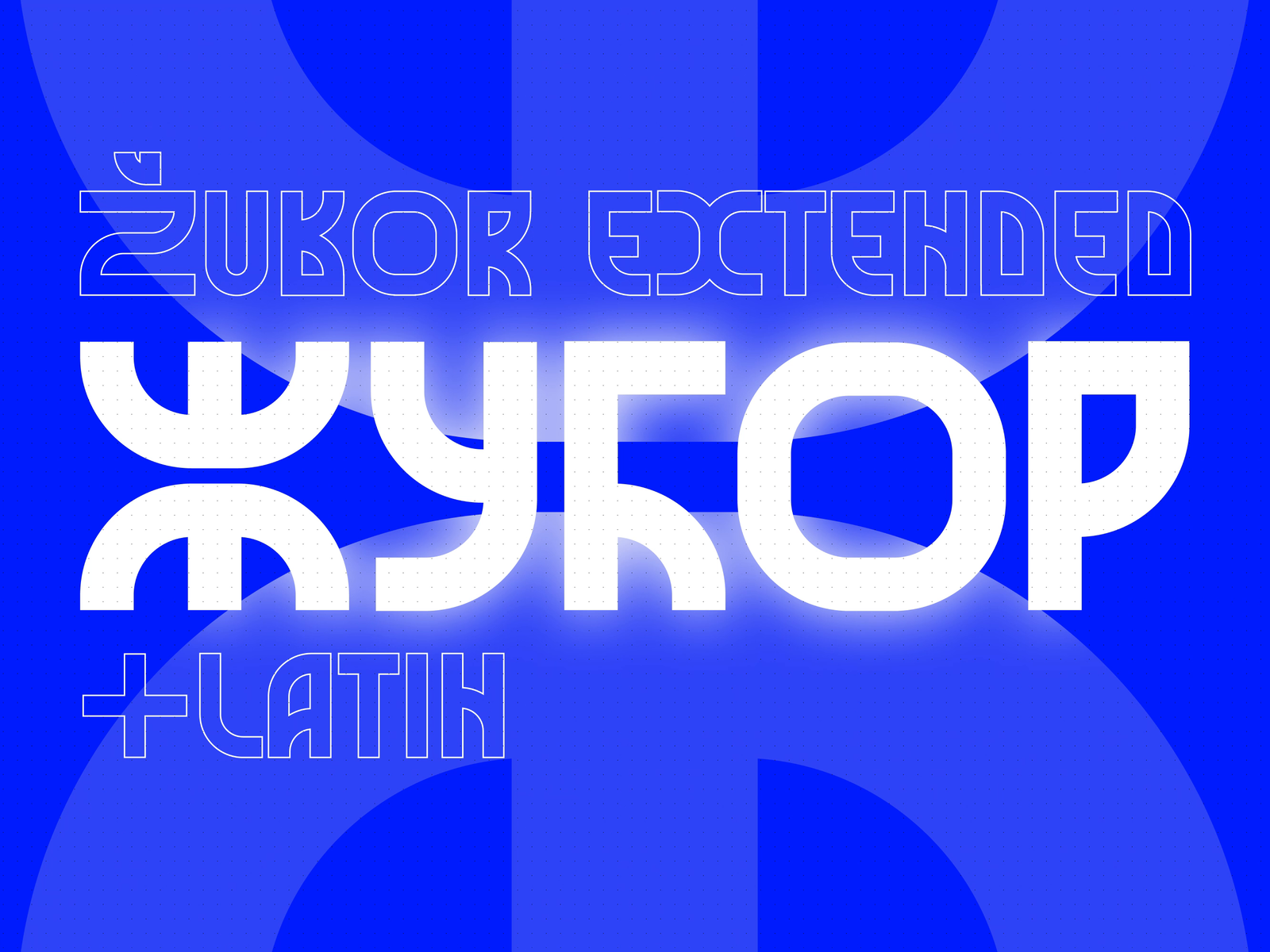
Жубор (Žubor) is a completely Cyrillic font made for the Serbian language. It is created from a need for a modern and a bit futuristic-looking font, while also going for that traditional vibe that I love. Throughout the project, it was r...