Good photography can elevate your UI designs, making them more visually appealing and more effective at getting users to take the desired actions. But what constitutes “good” photography? And how do you successfully incorporate it into your web and mobile designs?
There are a number of factors to consider, from the purpose of your photography to the specific ways you implement it. As with any design element, you’ll want to plan how you’ll implement it from the start.
Keep reading for seven essential tips to successfully incorporate photography in UI design.
Tip #1: Photos should serve a purpose
The first thing to consider when you’re looking at how to incorporate photography into your web or mobile app designs is the purpose it will serve.
Are they primarily to add visual interest? To support the content of the site? To showcase products?
Take time to figure out the purpose of various photos you might include. This will shape how you incorporate those photos into the finished design.

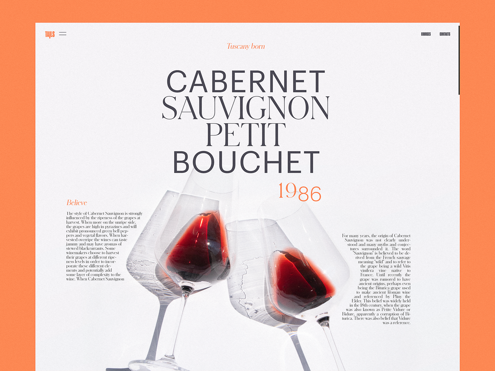
Tip #2: Consider the mood
The mood of your brand and the design itself should be kept in mind when choosing photography to use.
If your product or brand’s mood is formal and reserved, you probably don’t want to choose photos of cute puppies or amusement parks. If your mood is light-hearted and fun, you won’t want to fill it with photos of people in suits and corporate settings.
It can be helpful to create a moodboard for the photography you’ll use, with examples that fit the feelings and mood you want to evoke.
These moodboards can serve as a guide when you select the action photos to include and is especially helpful if you’re having any photos taken specifically for the site as you can share it with the photographer to make sure they understand your needs.

Tip #3: Keep things consistent
Consistency is key with any design element, and photography is no exception. There are a few things to keep in mind when creating consistency with your photos.
✔️ Style
First, make sure that the style of the photos is consistent. If you always include people in your photos, don’t suddenly use one of a forest. If your photos are always minimalist, don’t throw one in that’s visually cluttered.
Stick with either black and white or color photos (at the very least you’ll want to keep them consistent on each page). The composition of your photos, background colors, and content should all be kept within a defined set of guidelines.

✔️ Size & Shape
Second, make sure that the size and shape of your images are consistent. You may have more than one type of photo included in various parts of your design, which would mean needing multiple guidelines for their shape and size.
For example, you might have product images that should always be square, while hero images might need to be landscape-oriented and stretch across the entire screen.
You might also have certain photos that always have a particular shape mask, making them circular, for example.

✔️ Quality
Third, make sure the quality is consistent. If you’re using professional headshots mixed in with selfies on an about page, for example, there won’t be any harmony within the images. The same goes for making sure the resolution of your images is high enough for the sizes at which you’re using them.

Tip #4: Experiment with color saturation & overlays
Color overlays can be an excellent way to reinforce your branding. They’re also a useful tool if you need to use photos that vary in style or content. They create a sense of unity across all of the photos you use.
You’ll also want to be aware of the saturation of your photos. If some are super saturated and others are muted, it can cause the images to clash.
By adjusting the saturation on each photo you use to match, you create harmony on the page. Completely desaturating photos (making them grayscale) can hide a multitude of issues in photos from different sources with varying styles.

Tip #5: Use hero images
Hero images—images that stretch across the top of a web page—are a great way to draw in user attention. Photos are the most popular type of hero image. They should be eye-catching and reinforce the content of the page.
As with all photos, be sure to follow guidelines for consistency, content, and styling when selecting hero images for your pages.
You can opt to repeat the same hero image across multiple pages or use a unique photo for each.

Tip #6: Don’t be afraid to edit & manipulate
If stock photos are the only photography you have available for your design (which is the case for a lot of designers), don’t be afraid to edit or manipulate those photos (within the licensing limits, of course).
You can apply different filters; combine images; edit the saturation, contrast, temperature, or exposure; and make myriad other adjustments to the stock photos you use.

Tip #7: Stock or Custom? It depends…
If your budget allows, having bespoke photos taken for your design is a great way to elevate the photography beyond the basics.
Custom photos have some advantages over stock photos, primarily that they won’t be seen anywhere else and can be perfectly matched to the rest of your design. The downsides, though, are that they generally take more time and planning, and can be significantly more expensive than stock photos.
For that reason, many designers turn to stock photography for their designs. This is a totally viable option, and the techniques included here can help you make those photos integrate seamlessly into your site.

How to use photography in UI design
Whichever route you choose, be sure that you spend the same amount of time and effort on the photography of your site as you do on other design elements. If you want to get inspired by how other UI designers use photography in their work, browse tons of incredible UI designs on Dribbble. ■
 About the Author — Cameron Chapman: Editor. Blogger. Author. Designer. Copywriter. Marketer. Entrepreneur. Speaker. Consultant. Coach. I wear a lot of hats. What most of them have in common, though, is storytelling.
Find more Process stories on our blog Courtside. Have a suggestion? Contact stories@dribbble.com.


