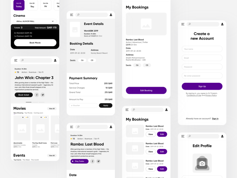
Every day, more and more products are designed mobile-first. The reason is simple: We live in a world where our mobile phones go nearly everywhere with us. This hasn’t always been the norm.
Nowadays, designers are challenged with fitting a ton of information that a monitor would usually display, on a much smaller screen. On top of that, designers have to keep up with the many different mobile device structures constantly emerging on the market (i.e. curved screens, notch displays, etc.).
Still, don’t let this fool you into thinking that designing for mobile is impossible. I’ve done the research so you don’t have to. Through my experience and research, I’ve come up with a list of simple tricks and techniques to help you with your next big project in mobile design.
Let’s jump straight into it:
1. Keep main actions accessible
Accessibility is the practice of making your products usable by as many people as possible. With “design for everyone” in mind, it’s important to consider the different ways people literally hold their mobile devices.
There are 3 main ways people physically hold their mobile phones (visualized below). The goal is to design main actions so they sit within these areas.

2. Consider readability
Mobile devices have smaller screens compared to desktops, so fitting a lot of information on a small mobile UI can be challenging. Good readability combined with other elements of design provides great UX.

3. Avoid the long-scroll problem
Long scrolling is a great way to keep users focused while reading long blocks of text. However in other cases, (for example, when users are prompted to complete a task), studies show that the more we scroll, the more we tend to lose interest or get frustrated.
Try to keep screens as short as possible using cards with a ‘tap to expand’ feature, or by breaking up tasks into screens.

4. Font type & size
Different fonts can evoke different emotions while providing easy readability at the same time. The wrong font choice can also break your design, which is why most designers spend a lot of time choosing just the right typefaces before anything else. Here are some important tips to keep in mind when it comes to fonts:
- Typeface: Choose a typeface that works well in multiple sizes and weights to maintain readability and usability in every size.
- Font-Size: Use a legible font size. Apple and Google recommend at least ~11 points so users can read it at a typical viewing distance without zooming.
- Color Contrast: Use contrast checkers to prevent color issues between font and background. Also, use the 60-30-10 rule which refers to an ideal proportion for reaching a balance among colors.
5. Allow enough spacing and padding
A smaller screen doesn’t necessarily mean you should use smaller text or less space. Don’t let text or other elements overlap. Improve legibility by increasing line height or element spacing.
Also keep in mind that new technologies are emerging every day, and as a designer, it’s important to stay up to date. For example, a curved phone display means increasing padding by a few pixels to avoid unwanted touches (~16pt is the minimum recommended padding for devices).

6. Design finger-friendly buttons
Accidental taps often happen because of small touch controls. To avoid this pain point, create controls that measure at least 10-12 mm (40px) so they can be accurately tapped with a finger.
To help you understand how important this tip is, think about ads you might see on a mobile experience. With ads, buttons are often very small, not easy to spot, and very hard to reach. Of course, the purpose of these CTAs is to prevent the accidental touches we all hate.

7. Keep tab bars clear and clean
Tab bars are part of every app, meaning you should be very careful when designing them. This is not the time to get creative.
Design clear and clean tab bars, and name all tabs whenever possible for better user experience. Use icons only when you are 110% sure that users will easily recognize and understand their purpose. If icons are a requirement, then their structure should contain as little design as possible.

8. Use familiar navigation bars
Try to use standard sequences for your navigation menu, like the iOS tab bar or Android nav drawer. Don’t try to reinvent the wheel. Users are familiar with these common patterns, so your app will be more intuitive to them. This also applies to other elements that are designed differently on these platforms.

Final thoughts
Remember, every time you finish a design, no matter what rules you follow or how good it performs in your eyes, you should always perform usability testing. I hope you find this article helpful and remember, put it into practice or you’ll forget about it!
![]() About the author: Dorjan Vulaj — UI/UX Designer / Educator / Influencer solving problems with design, then writing articles for people who are in a rush. I value your time, and probably like me, you like reading on the go. Find me on Instagram.
About the author: Dorjan Vulaj — UI/UX Designer / Educator / Influencer solving problems with design, then writing articles for people who are in a rush. I value your time, and probably like me, you like reading on the go. Find me on Instagram.
More UI/UX Resources
- 7 must-know tips for incorporating photography in UI design
- An ultimate guide to designing user-friendly forms
- 3 useful tips for designing neumorphic interfaces
Find more Process stories on our blog Courtside. Have a suggestion? Contact stories@dribbble.com.


