Linkedin Welcome Animation


I always liked LinkedIn and I think it's the social network with the biggest potential in the world, but I never really liked the interface as I think it lacks comprehensive detail and a branding guideline from web to mobile. Sometimes it doesn't even seem that we are using the same product when we change from mobile to web or web to mobile.
So, in my weekend free times I decided to give a try to a redesign concept. This is part of the work I've done this weekend. If the feedback turn out to be good I might keep going.
You can see a high resolution comparison between the two screens here. Don't forget to take a look on the full high resolution animation movie in attachment.
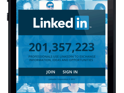
The thumbnails act as a preloader for the app, and the concept is for every appearing of the welcome screen it loads different thumbnails images on the background to make the app different every time the user uses it. The professionals counter would be real time. I want to give the interface a flat style and a rich user experience by making interactions fluid and organic. All images are from LinkedIn profiles. The awesome iPhone mockup is from @Pixeden and the icons (will replace them with custom mades) used now are from here.
Let me know what you think of this kickoff. Thanks!