State Property Fund of Ukraine / Brand book

State Property Fund of Ukraine
Task:
To conduct a comprehensive rebranding of the State Property Fund of Ukraine, which would demonstrate the renewal of the privatization process?
Decision:
Within the framework of the project, we created the adjusted positioning of the Fund, and also developed a complex of visual elements: a new logo, corporate style and a large brandbook.
The main message of the updated Foundation:
TRANSPARENCY AND PROFESSIONALISM
These two principles were used to create the new corporate style of the Fund, built on the principle of dynamic identity, when visual elements are transformed, but retain the recognition and consistency of the corporate identity.
The idea of transparency was conveyed thanks to the light, airy layout of communication materials, as well as the execution of business cards, envelopes and folders made from transparent plastic.
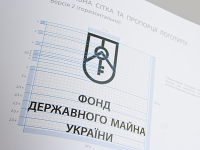
Also, we combined in the logo laconism and saturation with images:
1. CIRCULUS as a symbol of clear calculations;
2. KEY as a symbol of the possession of real estate and free access;
3. SHIELD as a symbol of state institution;
4. LATIN "F", formed by the teeth at the bottom of the key –
the capital letter of the word FUND;
5. MOUNTAIN as a symbol of success and high ambitions;
6. The general contour sign solution supports the idea of transparency.
https://www.behance.net/gallery/59518277/State-Property-Fund-of-Ukraine-Identity