CrossFeet Logo Concept 2

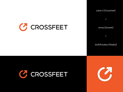
One of the concepts presented for CrossFeet - playful and edgy socks company that is committed to both producing good quality and great-looking socks that allows athletes to perform at their best with an aesthetic kick.
The client wanted to avoid anything related to feet or socks, so we brainstormed other ideas.
The symbol idea comes from a combination of letter C with an arrow, where the symbol is also 'on/off' button when rotated by 45 degrees.
Your thoughts? Appreciate your feedback :)