Letter L - 36 Days

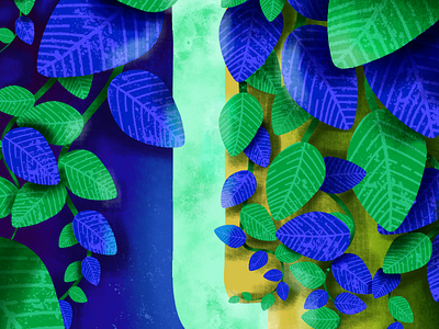
#DailyArts 014 - 🌿🌱🍃 I feel the colour consistency of my second 7 letters wasn't as uniform as my first 7, but I feel this is due to becoming more expressive and experimental in regards to depth, colour, and lighting 😁🙌 Each day I have tried to practice a new element of design, in these past few posts I have been trying to practice value balance and feel I have made some progress compared to the first several letters that feel flat without depth.
What do you guys think about this? Have my skills imprpved yet and what else could I improve?