


Daily UI #020 | Location Tracker

Although I was able to track the flight, there were a lot of things wrong with the flight tracking websites that I’ve used. I was welcomed with an overload of information. It was hard not to notice that the website pushed unwanted and unnecessary information right in my face. There were blog post previews, Tweets, and those advertisements. Not the thing I came to look for. It almost made me panic!
Jokes aside, it wasn’t easy to use the flight tracker and the lack of proper visual hierarchy and confusing controls didn’t make the welcoming better.
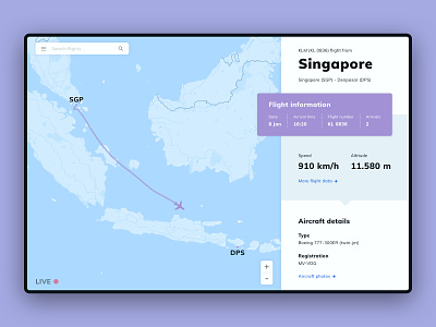
These problems were the starting point for today’s flight tracker interface. First of all, I got rid of the unnecessary information. The information that the interface now shows is minimal. The two most important flight stats are shown as speed and altitude. The other stats are hidden under the “more flight data” button. Like this, the other data can be accessed by those who want to see it—while it stays out of sight for those who don’t want to see it and are satisfied with the basic flight stats. This should avoid cluttered and confused first impressions—which should result in a higher user retention.
After that, I used proper visual hierarchy to make the information easier to digest. And I added control buttons to the large map to hint that this main element is interactable.
Let me know what you think!