


Sada Tetra Pack Design 2014-2015

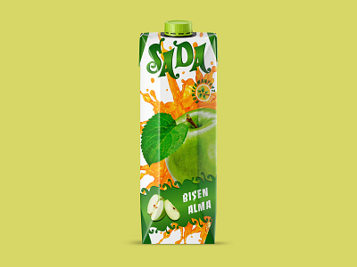


Tetra pack design for one and 0.5 litres juice of 20 flavours. As the first line of juice by the Sada factory, my purpose was to develop an exceptional & delicious pack concept for the population of Turkmenistan.
The country’s primary colour is green as the colour of flora, harvest, and fertility. What could be a better colour association for a beverage? Guided by these intense bonds, green became the highlight of my design. In order not to oversaturate the packaging, I used a white background with splash elements. To magnify the juice title, I have placed sliced fruits and berries next to it. As a result, the tetra pack concept looks competitive with both local and imported beverage products.
Design — Adobe Illustrator
Photo monipulation — Adobe Photoshop
Check out for more on Behance & Instagram
------------------
Don't forget to ❤️ Press “L” to support the shot and Follow me for more!
------------------
💌 I am open to new projects! design@katerinabot.com