Seed

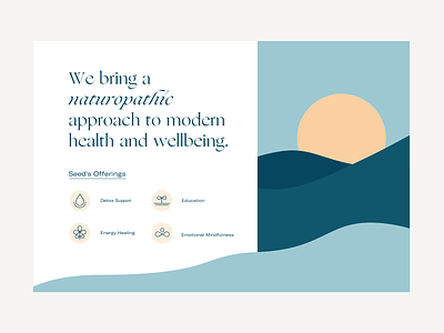
Here's another look at the dunes/waves created for Seed. I designed them with the potential to interact with the copy in a unique way so that the illustration didn't feel so boxed in.
The copy is supported by an icon system that primarily uses a seed or droplet shape. Whenever I design icons for brands, I try to repeat an lement through most of the icons. This creates a unique look and feel for something that doesn't always get that much attention.