Book Cover Design

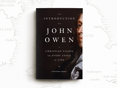
Cover design and map for An Introduction to John Owen.
The typeface used is ITC Founders Caslon which can be found here: https://www.myfonts.com/fonts/itc/founders-caslon/
Painting by John Greenhill
For those interested in further information:
The type treatment and layout is inspired by 17th and 18th century printing and cover design. The decision to crop Owen himself was twofold; there are numerous books on Owen all pulling from the same limited amount of paintings we have of him. So this was, in part, to take a fresh approach. Secondly, the book is not a strict biography, rather an exploration of his vision for spiritual living, thus less emphasis is placed on the man himself.
The map background is a little sneak of one of two maps I created for the interior, showcasing important places in Owen's life.
Fun Fact: While doing the research for the cover design, I discovered that most of the typefaces used in England during the 17th century were of Dutch origin. These were largely the Fell typefaces, named after their designer Doctor John Fell, Bishop of Oxford. Most have fallen out of use, but Caslon was designed in the 18th century with many of the same structural qualities of those earlier Fell typefaces.