Water Education Colorado Logo Design Process 5

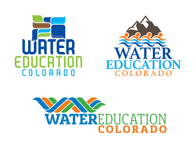
Now we're getting somewhere! The client has (hopefully) fallen in love with a concept, and now is the time to make it shine by exploring all the typographic and color possibilities. Note: the client did, in fact, fall in love with this concept. The use of stylized watershed map of Colorado spoke to their core value proposition(s) and brand story.
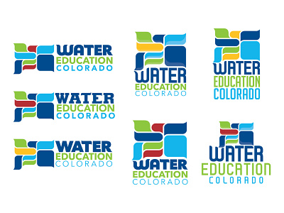
Descriptions for each version presented during this phase become less conceptual, and more pragmatic. An example might read "Clean, bold, and simplified type treatment. Flat color palette that has been reorganized from initial concept. Reproportioned watershed shapes, and intentionally asymmetrical alignment."