Sinewave Website Redesign


On my first post presenting sinewave's website, I mentioned the fact that it was still an MVP and that I was not entirely satisfied with it. So last week I started preparing the ground for its revamp.
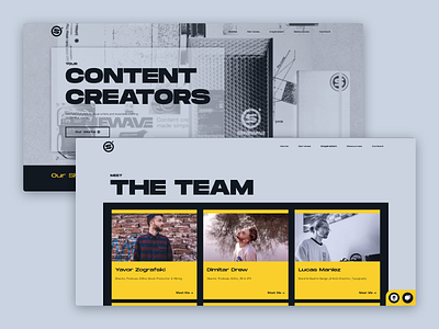
I collected data from analytics, interviewed a few people to understand their use of it, and what they generally thought of it. I reviewed in-depth the user flow and content architecture so it's clearer. I cleaned up the type hierarchy that ended up "broken" in the first version due to all the minor fixes.
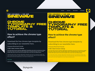
This time I started fresh and designed better. I understood where the mistakes were, and corrected them. It's still a work in progress, but overall it feels more stable, clean, with more obvious patterns. We're also reworking on the content so the value proposition is better stated. It felt a bit all over the place.
What do you make of it?
Do you feel it's actually an upgrade or did I completely missed the spot? Make sure to compare rebound and original, and let me know in the comments! 🙂
Have a good one!