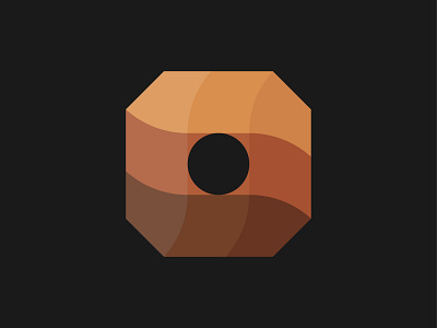
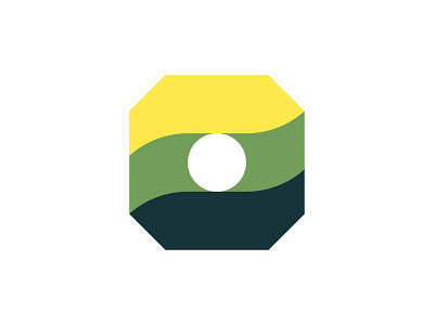
Weheat Logo Concept / Biofuel Company

Hi Dribbblers! Which one do you prefer? Green or Brown version?
Today I want to share with you another logo concept for biofuel company - Weheat 🔥
❓Recently, @sircharlieowl and I worked on one project to create a logo that has a modern touch, feels strong and powerful, gives energy and in the same time is warm and eco-friendly.
🌍 This concept represents a wooden briquette as eco-friendly fuel. Green and powerful colors. Logo looks high to the right.
Which one do you like more, green or brown version?
Love feedback :D