Tiziano - a women's clothing store

In this job, I have worked out all the references my customer wanted to mention in a package of a concise and solid logotype.
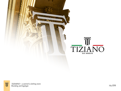
The first reference to show was that it's all luxurious brands represented in the store and the design should have stated that, however, without creating a "heavy design". To work that out I have chosen a solid serif font (Times New Roman for example) first. But the problem with the serif fonts is that they are usually heavier than grotesque ones (Arial or Helvetica). To work that out I made a larger spacing between elements so that more "air" could pass through the logotype. It resulted in solidness and lightness in the design at the same time.
The logo mark was a tougher task because I wanted to include another reference that my customer wanted to underline - the situation of the store in the historical part of the city. Keeping in mind that all the brands present in the store were Italian and the name of the store started with T - I made it look like the capital of a column, taking an Italo-Corinthian order capital as a reference. That worked out pretty well.
The last thing was to balance the shape of the logotype in the spaces to the right and left of the graphic element. I chose Two stripes to fill in the gap and painted them in Italian flag colors.
When the work on the logotype was done I picked a grotesque font pair to the main serif one to create a contrast. That helps to make headings more noticeable and the usage of a grotesque font for texts to make them more comprehensive and easy to keep readers' attention. I have also created guidelines for content parts such as power lines, and attention vectors that resulted in a unified grid for any type of content.
And of course colors. The easiest part of this project - after creating a logo it was obvious to use green and red from the Italian flag. Then I picked a shade of black suiting them. At last, I chose Sunset gold for a background as I was relying on a Pantone's Color of the Year guide which helped me to pick it to suit the previously picked colors.