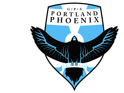
GPS Portland Phoenix Crest
My hometown of Portland, ME, has a 4th-tier soccer team called the GPS Portland Phoenix. They play in the PDL, and their logo is – I don't want to be rude, but I think it would be hard to say it's not terrible (see here: http://www.uslsoccer.com/teams/2012/20204270.html ). There's some sort of pterodactyl involved?
I thought it'd be fun to redesign. I put this together pretty quickly based on their colors and the whole "Phoenix" motif. There's also a little bit of a lighthouse theme, because those are big in Maine.
I'll freely admit that I didn't put a ton of thought or time into this – it was just a few hours fleshing out something for fun. I'm surprisingly pleased with it, though, for the amount of time invested. I don't know.
The scroll in the bird's claws says "EX•FAVILLA," which I'm pretty sure means "from [the] ashes," but beyond that being a Phoenix-y thing, I don't know what relevance that has to the team or Portland. There was the 1866 Great Fire, I guess. It just seemed like the bird needed a scroll. And who was I to say no?
What do you think?

