Post Card SUMMER SALE

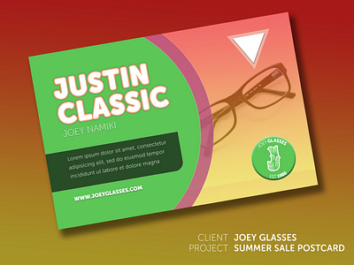
It's summer sale. Therefore, I used a warm gradation on the background image in order for users to be able imagine summer immediately.
Additionally, I used the purple color which people feel impressed stylish and fashion because this is one of the fashion items.
The logo looks like a tree. Therefore, I used the green color behind it to associate the logo with nature. As the same effect, I put the color on the background of the main element to connect the main brand name to the company immediately.
The priority of the text under "Joey Namiki" is lower than any others. Thus, I put little darker color behind it to emphasize the other element.
The triangle object represents the arrow which directs the glasses to highlight the main item of this poster.