Room - Mobile Responsive

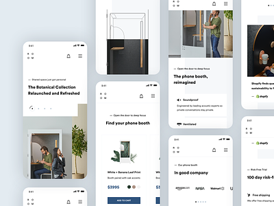
Incorporating the values of mobile responsiveness, ROOM's redesign concept ensures that the landing page of telephone booth products is optimized for seamless and engaging experiences across various devices.
Recognizing the growing prevalence of mobile usage, a responsive design approach accommodates users accessing the website on smartphones and tablets. By employing responsive web design techniques, the content, and layout adapt fluidly to different screen sizes, maintaining readability, functionality, and visual appeal.
The value of mobile responsiveness lies in providing a consistent and user-friendly experience regardless of the device being used. This means that potential customers can effortlessly browse and interact with the website, exploring the details page of telephone booth products, no matter if they are on a desktop computer or on the go with their mobile device.
