"Tazza" coffee packaging design

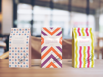
My first attempt at a hand lettered logo and packaging design. I wanted to create a series of coffee bag designs with patterns and colours reflecting different blends of coffee (Sunday morning, Deep focus, Energize) tied together by interesting copywriting.
I made the logo look like a stamp, which I think is a nice accent for a local roastery. The name of the company is borrowed from one of the Daily Logo Challenge prompts.
